#1
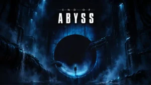
The blue-lit industrial horror aesthetic is a major strength, with striking lighting, shadows, grotesque creature imagery, and carefully staged spaces creating a distinctive look.
Pros: atmosphere, exploration quality
Cons: map and navigation design, bug frequency
#2
The Nordic landscapes, weather, lighting, architecture, and strong visual mood have aged extremely well. Even reviewers who call the raw graphics dated still praise the art direction for making Skyrim...
Pros: graphics quality, progression system
Cons: combat system, bug frequency
#3
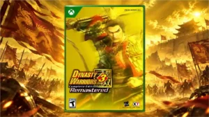
Updated outfits, menus, and environments preserve the PS2 identity while giving the game a polished modern visual style.
Pros: remake/remaster quality, graphics quality
Cons: difficulty balance, voice acting
#4
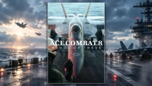
Cinematography, shot framing, and visual composition earn exceptional praise and help sell both the spectacle and the drama.
Pros: narrative quality, fun factor
Cons: dialogue quality, difficulty balance
#5
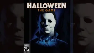
Rainy streets, glowing interiors, and careful lighting give Haddonfield a striking, film-like visual identity.
Pros: fun factor, multiplayer design
Cons: bug frequency, AI behavior
#6
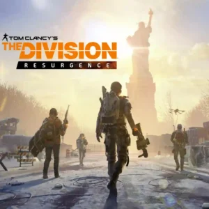
Snow-covered New York convincingly recreates the original game's visual identity and post-crisis mood.
Pros: content variety, controls responsiveness
Cons: narrative quality, menu usability
#7
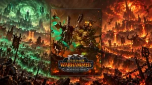
Bespoke character and mount designs fit the setting well and give major additions a suitably dramatic Warhammer look.
Pros: gameplay mechanics, fun factor
Cons: AI behavior, polish
#8
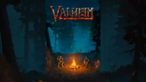
The deliberately low-fi, pixelated style is repeatedly called beautiful, distinctive, and timeless, helped by cohesive Norse imagery and strong lighting.
Pros: town-building system, exploration quality
Cons: grind level, fast travel convenience
#9
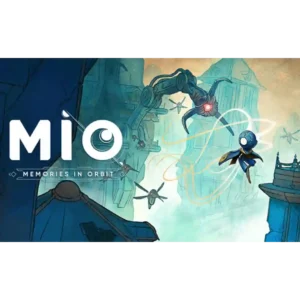
The watercolor, sketchbook, and graphic-novel look is the game’s most consistent standout. Distinct biomes, muted pastels, bold shapes, and tiny environmental details make The Vessel striking even when the action...
Pros: movement feel, originality
Cons: difficulty balance, combat system
#10
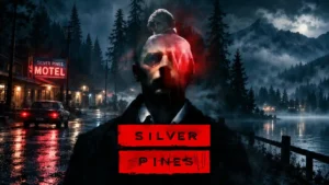
Painterly environments, rotoscoped figures, subdued colors, and noir lighting give the game an immediately recognizable look. The art is among its most consistently praised strengths.
Pros: overall quality, atmosphere
Cons: boss design, movement feel
#11
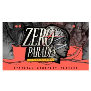
The painterly, graphic-novel-inspired visuals are one of the game’s clearest strengths. Portofiro’s beauty, grime, neon color, and surreal imagery consistently reinforce its political and psychological tone.
Pros: narrative quality, writing quality
Cons: pacing, bug frequency
#12
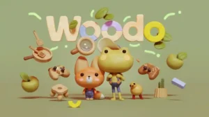
Hand-carved wooden pieces, soft color and cohesive toy-box styling are the standout attraction. Even critics of the repetition found the miniature worlds hard to resist.
Pros: art direction, narrative quality
Cons: difficulty balance, replay value
#13
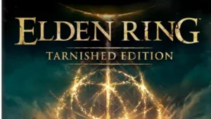
The art direction remains one of the game’s clearest strengths: dramatic vistas, strange creatures, monumental architecture, and a distinctive dark-fantasy style survive the Switch 2 downgrade exceptionally well.
Pros: performance optimization, frame rate stability
Cons: controller ergonomics, platform-specific feature support
#14
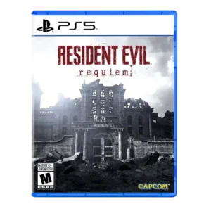
Art direction was praised for grotesque beauty and an effective old/new visual mix.
Pros: pacing, combat system
Cons: originality
#15
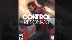
The warped Manhattan, Patterning effects, impossible architecture, and surreal set pieces are among the game's clearest triumphs. Its visual identity is repeatedly described as bold, gorgeous, and unlike almost anything...
Pros: combat system, narrative quality
Cons: boss design, map and navigation design
#16
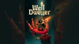
The hand-drawn, storybook presentation is one of the strongest points of agreement. Reviewers especially liked its balance of cute woodland characters, grim fairy-tale imagery, detailed backgrounds, and unsettling boss designs.
Pros: difficulty balance, boss design
Cons: innovation, sandbox freedom
#17
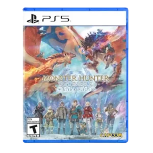
The stylized, colorful presentation is one of the game's clearest strengths, blending a more mature look with the charm of the Stories subseries.
Pros: combat system, narrative quality
Cons: difficulty balance, grind level
#18
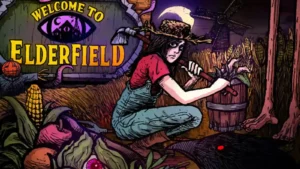
Hand-drawn horror illustrations, muted pixel art, manga influences, and cozy visual cues combine into a distinctive identity. The contrast between cute routine and grotesque imagery is consistently praised.
Pros: combat system, difficulty balance
Cons: progression system, bug frequency
#19
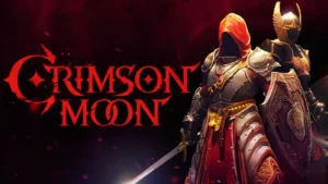
The Gothic, religious-fantasy art direction is one of the clearest strengths, with ornate cathedrals, striking armor, and a strong visual identity that often looks above its budget.
Pros: value for money, combat system
Cons: camera behavior, content variety
#20
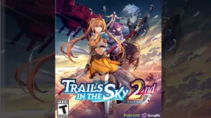
The bright anime-inspired 3D style is viewed as a polished, appealing modernization of Liberl, with bold color and a clear visual identity.
Pros: combat system, narrative quality
Cons: pacing, onboarding experience
#21
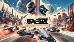
Grimy machinery, distinct planetary biomes, and cinematic lighting strongly capture the franchise's visual character. The worn, practical aesthetic is repeatedly praised alongside the game's richer colors and striking environments.
Pros: fun factor, overall quality
Cons: difficulty balance, pacing
#22
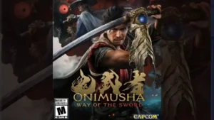
Reviewers consistently praise the grotesque Genma, corrupted Kyoto, historical architecture, and supernatural imagery. The aesthetic feels recognizably Onimusha while benefiting from much richer modern detail.
Pros: combat system, fun factor
Cons: pacing, open-world design
#23
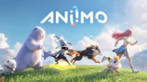
Aniimo’s strongest visual identity comes from its colorful world and distinctive creature designs, which are repeatedly described as lovely, creative, cute, and memorable.
Pros: fun factor, gameplay mechanics
Cons: monetization fairness, menu usability
#24
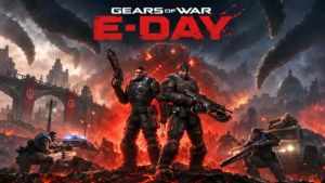
Industrial architecture, gothic touches, harsh lighting, and collapsing urban spaces give Kalona a distinctive visual identity.
Pros: combat system, graphics quality
Cons: exploration quality, mission design
#25
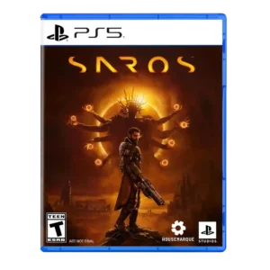
Art direction was a clear strength, with reviewers highlighting Carcosa’s strong, alien visual identity and memorable environmental design.
Pros: narrative quality, combat system
Cons: side character depth, dialogue quality
#26
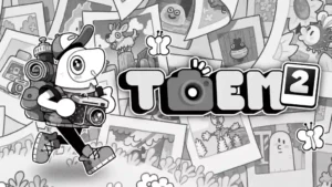
The black-and-white diorama look remains one of the game’s defining strengths, with richer 3D depth and playful detail. A minority preference for the flatter original style makes the visual upgrade...
Pros: game length, gameplay mechanics
Cons: innovation, difficulty balance
#27
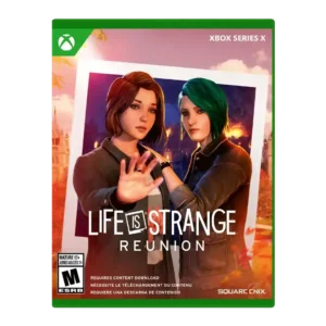
The warm autumn palette and lightly painterly presentation preserve the series’ distinctive visual identity while giving Caledon an inviting, bittersweet look.
Pros: emotional impact, choice impact
Cons: narrative quality, bug frequency
#28
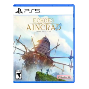
Art direction was highly praised for anime stylization and faithfulness to Sword Art Online's visual style.
Pros: combat system, companion AI
Cons: open-world design, movement feel
#29
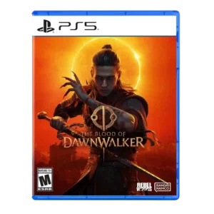
The visual style earns strong praise for its gothic, dark-fantasy identity. The art direction helps Vale Sangora feel distinctive even when technical presentation is inconsistent.
Pros: combat system, fun factor
Cons: content variety, polish
#30
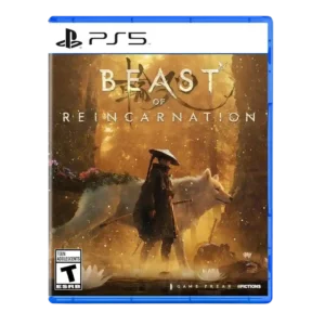
Overgrown concrete, plant-infested creatures, sci-fi ruins, and anime-inspired character design create a striking identity. The art direction balances beauty, melancholy, and horror particularly well.
Pros: combat system, companion AI
#31
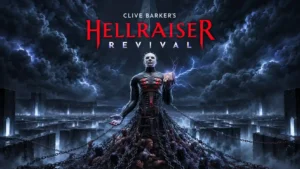
Surreal flesh, metal, religious imagery, and impossible architecture give the game striking visual character. The strongest praise concerns imaginative environments rather than novelty in the underlying mechanics.
Pros: faithfulness to franchise, narrative quality
Cons: combat system, boss design
#32
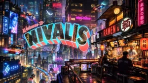
Voxel-inspired architecture, neon color, and stylized characters create a distinctive visual identity. The smoother character models divide initial impressions, though many find the combination effective.
Pros: overall quality, shopkeeping system
Cons: performance optimization, pacing
#33
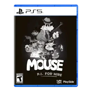
The monochrome 1930s cartoon-noir look gives the game an instantly recognizable identity and carries through nearly every visual detail. Even more skeptical players generally found the style striking, though a...
Pros: fun factor, art direction
Cons: weapon balance, gameplay mechanics
#34
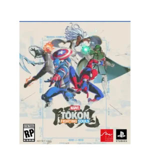
The art direction is repeatedly praised for its manga/comic hybrid identity, sharp comic-book look, and Japanese reinterpretation of Marvel.
Pros: fun factor, character roster
Cons: tutorial quality, competitive balance
#35
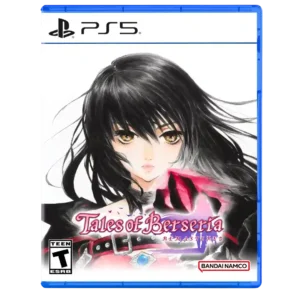
The anime and watercolor-inspired art direction continues to hold up well, with reviewers praising its style even when textures and environments look dated.
Pros: narrative quality, combat system
Cons: remake/remaster quality, value for money
#36
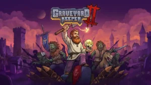
The detailed pixel-art style remains a standout, with critics praising how attractive and distinctive the world looks. Even when the sequel stays close to the first game visually, the presentation...
Pros: fun factor, core gameplay loop
Cons: grind level, learning curve
#37
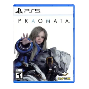
Art direction is a standout, especially the NASA-punk, AI-slop, lunar-base, and uncanny Earth-replica aesthetics.
Pros: combat system, emotional impact
Cons: map and navigation design, platforming precision
#38
The low-poly, brown-and-neon Y2K cyberpunk look is one of the game's most consistently praised qualities. A few players find the deliberately drab palette monotonous, but the style itself is unusually...
Pros: fun factor, core gameplay loop
Cons: difficulty balance, narrative quality
#39
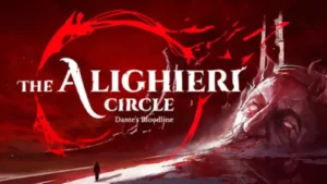
The game’s strongest visual ideas come from its red-and-white infernal imagery, dramatic lighting, and richly styled villa. Most praise the look, though one take finds the interpretation of Hell visually...
Pros: puzzle design, atmosphere
Cons: narrative quality, difficulty balance
#40
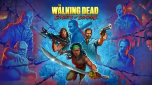
The retro pixel-art characters against 3D or polygonal environments are one of the most consistently praised parts of the game. The style feels distinctive, recognizable, and well suited to The...
Pros: fun factor, faithfulness to franchise
Cons: combat system, game length
#41
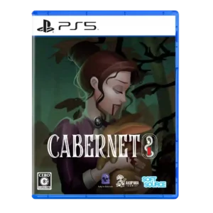
Art direction was a major strength, with praise for detailed characters, striking storybook aesthetics, gothic setting, and strong visual identity.
Pros: narrative quality, voice acting
Cons: bug frequency, menu usability
#42
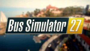
The switchable Classic and Realistic looks are a hit, with strong color grading and the ability to choose between vibrant and more natural presentation.
Pros: open-world design, fun factor
Cons: AI behavior, polish
#43
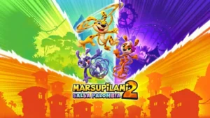
The colorful cartoon look is one of the game's clearest strengths, with vibrant worlds and strong visual personality. Some critics still find parts of the style derivative of other platformers.
Pros: replay value, difficulty balance
Cons: game length, boss design
#44
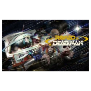
Art direction earns near-universal enthusiasm. The game constantly shifts among 3D action, pixel art, comics, animation, retro interfaces, and other styles while retaining a distinct Grasshopper identity.
Pros: fun factor, originality
Cons: combat system, narrative quality
#45
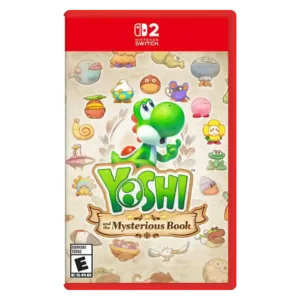
The hand-drawn, watercolor storybook presentation is one of the game’s clearest strengths. Reviewers repeatedly praised its bright environments, imaginative creatures, and warm illustrated look.
Pros: art direction, exploration quality
Cons: difficulty balance, core gameplay loop
#46
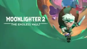
The cel-shaded 3D makeover is widely praised as colorful, charming, and a natural evolution, though a minority still miss the first game's whimsical pixel art.
Pros: core gameplay loop, difficulty balance
Cons: narrative quality, load times
#47
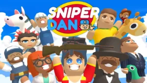
The bright, exaggerated cartoon style is widely praised for fitting the silly tone and keeping busy scenes readable, though a few reviewers find locations visually repetitive.
Pros: fun factor, art direction
Cons: difficulty balance, hint system
#48
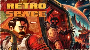
Chunky terminals, pixelated textures, and colorful 1970s styling give Aurora 5 a memorable identity. Most love the disco-punk look, though one finds its historical aesthetic more decorative than meaningful.
Pros: overall quality, art direction
Cons: map and navigation design, difficulty balance
#49
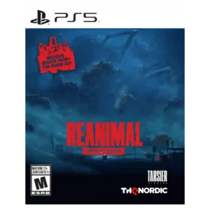
Art direction is a standout strength, especially lighting, staging, visual composition, and grim aesthetic commitment.
Pros: narrative quality, atmosphere
Cons: puzzle design, fun factor
#50
The blocky Minecraft look gains color and personality from the otherworldly Sift and varied Overworld biomes. Some still find the style familiar or insufficiently spectacular.
Pros: open-world design, graphics quality
Cons: narrative quality, endgame content