Best for art direction
End of Abyss
5.0 attribute score
Highest scored product for this attribute based on supporting review evidence.

Highest scored product for this attribute based on supporting review evidence.
Balances the attribute score, supporting reviews, and overall product strength.
Has the broadest review evidence for this attribute.
Strongest overall product among items with scored evidence for this attribute.
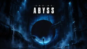
The blue-lit industrial horror aesthetic is a major strength, with striking lighting, shadows, grotesque creature imagery, and carefully staged spaces creating a distinctive look.
Pros: atmosphere, exploration quality
Cons: map and navigation design, bug frequency
Art direction was a major strength, with repeated praise for the graffiti, hip-hop, urban, and colorful visual identity.
Pros: accessibility options, combat system
Cons: narrative quality, frame rate stability
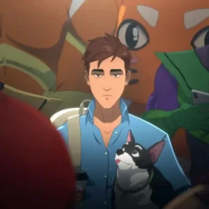
The comic-inspired presentation earns strong praise for its distinctive, polished look. Reviewers particularly like its stylized superhero aesthetic and character designs.
Pros: choice impact, narrative quality
Cons: gameplay mechanics, QTE design
The Nordic landscapes, weather, lighting, architecture, and strong visual mood have aged extremely well. Even reviewers who call the raw graphics dated still praise the art direction for making Skyrim...
Pros: graphics quality, progression system
Cons: combat system, bug frequency
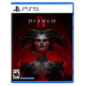
Art direction was a standout strength, with reviewers praising Diablo IV’s darker horror look and expansion region aesthetics.
Pros: narrative quality, endgame content
Cons: monetization fairness, quest design
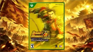
Updated outfits, menus, and environments preserve the PS2 identity while giving the game a polished modern visual style.
Pros: remake/remaster quality, graphics quality
Cons: difficulty balance, voice acting
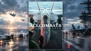
Cinematography, shot framing, and visual composition earn exceptional praise and help sell both the spectacle and the drama.
Pros: narrative quality, fun factor
Cons: dialogue quality, difficulty balance
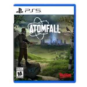
Art direction was praised for melding lush countryside, decay, color, and atmosphere into a distinctive look.
Pros: narrative quality, exploration quality
Cons: combat system, AI behavior
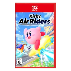
Art direction received high praise for colorful, dynamic environments and a striking Switch 2 look.
Pros: battle mode quality, content variety
Cons: learning curve, competitive balance
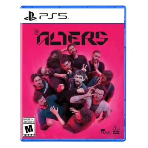
Art direction received strong praise for the alien planet, visual design, and Jan/Alter presentation.
Pros: narrative quality, replay value
Cons: difficulty balance, pacing
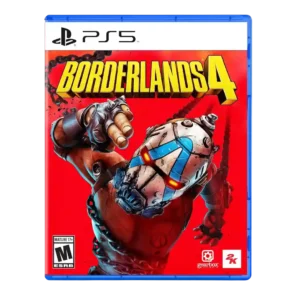
Art direction receives strong praise for the series’ comic-book style being more striking than before.
Pros: movement feel, loot system
Cons: performance optimization, narrative quality
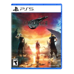
Art direction receives high praise for maximalist world creation and imaginative modern design.
Pros: combat system, content variety
Cons: pacing, movement feel
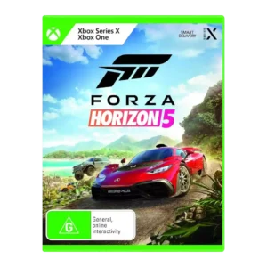
Art direction is praised for making Mexico’s culture, music, murals, and ambience feel authentic.
Pros: graphics quality, accessibility options
Cons: AI behavior, difficulty balance
Rainy streets, glowing interiors, and careful lighting give Haddonfield a striking, film-like visual identity.
Pros: fun factor, multiplayer design
Cons: bug frequency, AI behavior
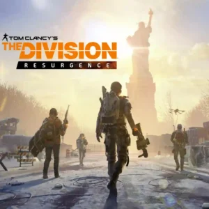
Snow-covered New York convincingly recreates the original game's visual identity and post-crisis mood.
Pros: content variety, controls responsiveness
Cons: narrative quality, menu usability
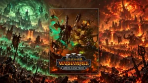
Bespoke character and mount designs fit the setting well and give major additions a suitably dramatic Warhammer look.
Pros: gameplay mechanics, fun factor
Cons: AI behavior, polish
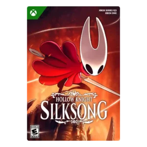
Art direction receives near-universal praise for hand-drawn beauty, color variety, style, and a distinctive visual identity.
Pros: difficulty balance, art direction
Cons: economy and resource balance, checkpoint system
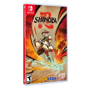
The hand-drawn art direction receives near-universal praise for its style, cohesion, painterly look, and strong franchise fit.
Pros: combat system, faithfulness to franchise
Cons: narrative quality, frame rate stability
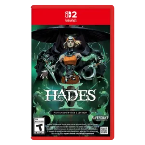
Art direction is one of the strongest points, with repeated praise for character art, color, portraits, and Supergiant's visual identity.
Pros: combat system, progression system
Cons: originality
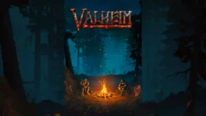
The deliberately low-fi, pixelated style is repeatedly called beautiful, distinctive, and timeless, helped by cohesive Norse imagery and strong lighting.
Pros: town-building system, exploration quality
Cons: grind level, fast travel convenience
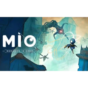
The watercolor, sketchbook, and graphic-novel look is the game’s most consistent standout. Distinct biomes, muted pastels, bold shapes, and tiny environmental details make The Vessel striking even when the action...
Pros: movement feel, originality
Cons: difficulty balance, combat system
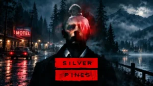
Painterly environments, rotoscoped figures, subdued colors, and noir lighting give the game an immediately recognizable look. The art is among its most consistently praised strengths.
Pros: overall quality, atmosphere
Cons: boss design, movement feel
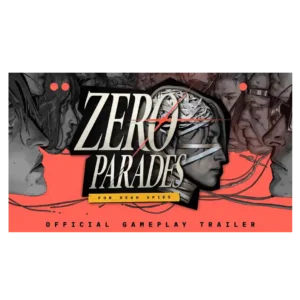
The painterly, graphic-novel-inspired visuals are one of the game’s clearest strengths. Portofiro’s beauty, grime, neon color, and surreal imagery consistently reinforce its political and psychological tone.
Pros: narrative quality, writing quality
Cons: pacing, bug frequency
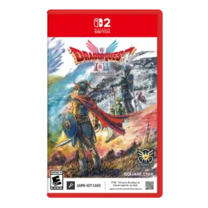
The HD-2D art direction was strongly praised for respecting old JRPG roots while making the worlds feel striking and modern.
Pros: remake/remaster quality, combat system
Cons: difficulty balance, grind level
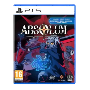
Art direction was one of the strongest consensus positives, repeatedly described as gorgeous, striking, or beautifully stylized.
Pros: combat system, replay value
Cons: narrative quality, grind level
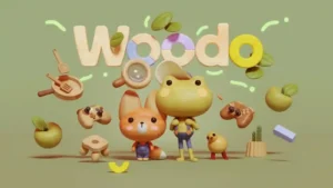
Hand-carved wooden pieces, soft color and cohesive toy-box styling are the standout attraction. Even critics of the repetition found the miniature worlds hard to resist.
Pros: art direction, narrative quality
Cons: difficulty balance, replay value
The art direction remains one of the game’s clearest strengths: dramatic vistas, strange creatures, monumental architecture, and a distinctive dark-fantasy style survive the Switch 2 downgrade exceptionally well.
Pros: performance optimization, frame rate stability
Cons: controller ergonomics, platform-specific feature support
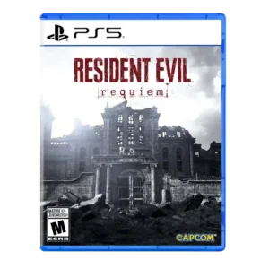
Art direction was praised for grotesque beauty and an effective old/new visual mix.
Pros: pacing, combat system
Cons: originality
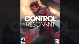
The warped Manhattan, Patterning effects, impossible architecture, and surreal set pieces are among the game's clearest triumphs. Its visual identity is repeatedly described as bold, gorgeous, and unlike almost anything...
Pros: combat system, narrative quality
Cons: boss design, map and navigation design
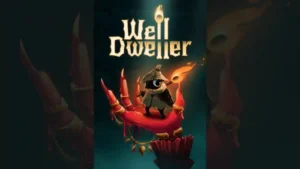
The hand-drawn, storybook presentation is one of the strongest points of agreement. Reviewers especially liked its balance of cute woodland characters, grim fairy-tale imagery, detailed backgrounds, and unsettling boss designs.
Pros: difficulty balance, boss design
Cons: innovation, sandbox freedom
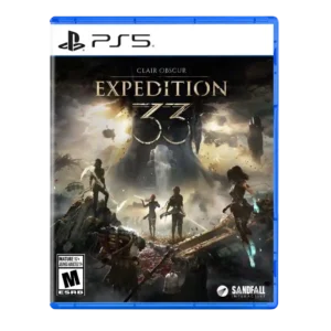
Art direction was highly praised for beauty, French-inspired style, surreal environments, and cohesive visual identity.
Pros: narrative quality, combat system
Cons: map and navigation design, menu usability
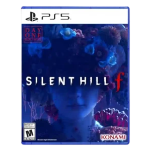
Art direction was one of the clearest strengths, with reviewers repeatedly praising the beauty-in-terror concept, monster imagery, and striking visual identity.
Pros: puzzle design, narrative quality
Cons: combat system, enemy variety
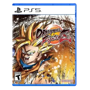
Art direction earns very high marks for faithful cel shading, Toriyama-style character work, and deliberate anime framing.
Pros: combat system, accessibility options
Cons: narrative quality, matchmaking quality
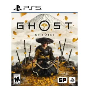
Reviewers strongly praise the painterly visual identity, lighting, color, and intentional environmental effects, with only mild familiarity concerns.
Pros: combat system, narrative quality
Cons: grind level, innovation
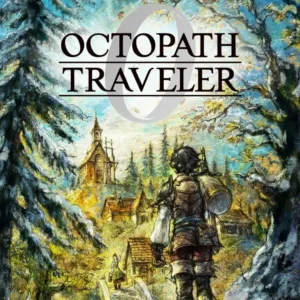
The HD-2D presentation remains a major attraction, with dramatic lighting, sprite work, and a diorama-like visual style that several reviewers regard as one of the series' defining strengths.
Pros: narrative quality, combat system
Cons: pacing, side character depth
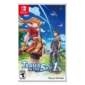
Art direction was praised for vibrant, expressive presentation and faithful anime-style modernization.
Pros: remake/remaster quality, combat system
Cons: content variety
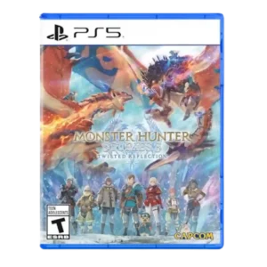
The stylized, colorful presentation is one of the game's clearest strengths, blending a more mature look with the charm of the Stories subseries.
Pros: combat system, narrative quality
Cons: difficulty balance, grind level
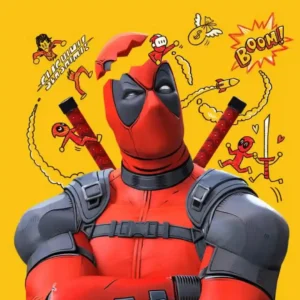
The cel-shaded comic-book presentation is one of the game's most celebrated qualities, with bold outlines, vibrant colors, and a look that feels naturally suited to Deadpool and Marvel.
Pros: combat system, voice acting
Cons: pacing, boss design
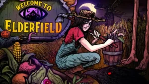
Hand-drawn horror illustrations, muted pixel art, manga influences, and cozy visual cues combine into a distinctive identity. The contrast between cute routine and grotesque imagery is consistently praised.
Pros: combat system, difficulty balance
Cons: progression system, bug frequency
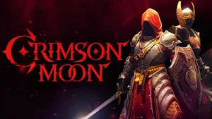
The Gothic, religious-fantasy art direction is one of the clearest strengths, with ornate cathedrals, striking armor, and a strong visual identity that often looks above its budget.
Pros: value for money, combat system
Cons: camera behavior, content variety
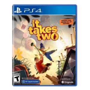
Art direction is widely praised as remarkable, gorgeous, imaginative, and strong enough to survive Switch visual compromises.
Pros: co-op experience, fun factor
Cons: narrative quality, dialogue quality
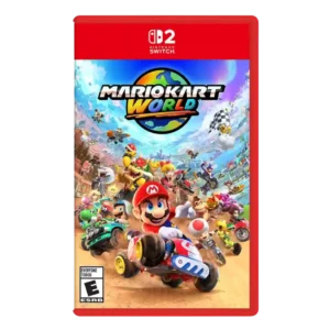
Art direction was strongly praised as stellar, charming, vibrant, and one of the game’s best aspects.
Pros: content variety, soundtrack quality
Cons: open-world design, exploration quality
The bright anime-inspired 3D style is viewed as a polished, appealing modernization of Liberl, with bold color and a clear visual identity.
Pros: combat system, narrative quality
Cons: pacing, onboarding experience
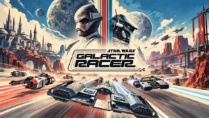
Grimy machinery, distinct planetary biomes, and cinematic lighting strongly capture the franchise's visual character. The worn, practical aesthetic is repeatedly praised alongside the game's richer colors and striking environments.
Pros: fun factor, overall quality
Cons: difficulty balance, pacing
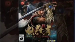
Reviewers consistently praise the grotesque Genma, corrupted Kyoto, historical architecture, and supernatural imagery. The aesthetic feels recognizably Onimusha while benefiting from much richer modern detail.
Pros: combat system, fun factor
Cons: pacing, open-world design
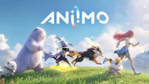
Aniimo’s strongest visual identity comes from its colorful world and distinctive creature designs, which are repeatedly described as lovely, creative, cute, and memorable.
Pros: fun factor, gameplay mechanics
Cons: monetization fairness, menu usability
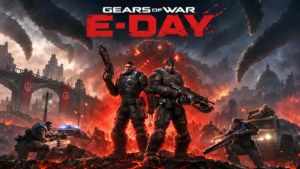
Industrial architecture, gothic touches, harsh lighting, and collapsing urban spaces give Kalona a distinctive visual identity.
Pros: combat system, graphics quality
Cons: exploration quality, mission design
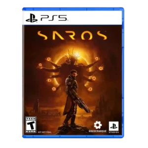
Art direction was a clear strength, with reviewers highlighting Carcosa’s strong, alien visual identity and memorable environmental design.
Pros: narrative quality, combat system
Cons: side character depth, dialogue quality
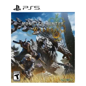
Art direction received strong praise, especially for armor and overall visual identity reaching a franchise high point.
Pros: combat system, narrative quality
Cons: difficulty balance, endgame content
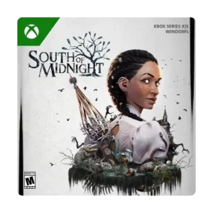
Art direction was one of the clearest strengths, repeatedly described as striking, gorgeous, phenomenal, or top-notch.
Pros: soundtrack quality, narrative quality
Cons: combat system, enemy variety