#1
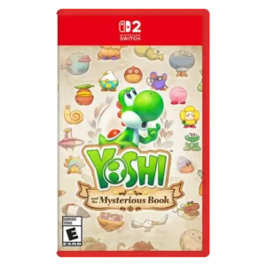
The hand-drawn, watercolor storybook presentation is one of the game’s clearest strengths. Reviewers repeatedly praised its bright environments, imaginative creatures, and warm illustrated look.
Pros: art direction, exploration quality
Cons: difficulty balance, core gameplay loop
#2
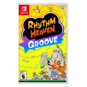
Art direction is consistently praised for vibrant, memorable cartoon scenes, varied styles, and a look that still feels close to the franchise identity.
Pros: fun factor, difficulty balance
Cons: value for money
#3
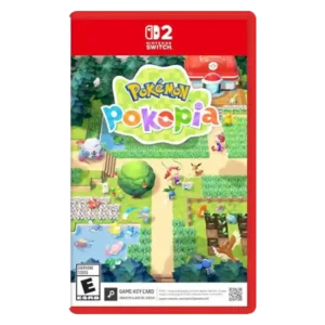
Reviewers liked the cute, bright visual style, with praise for gorgeous art and a distinct look.
Pros: core gameplay loop, content variety
Cons: pacing, menu usability
#4
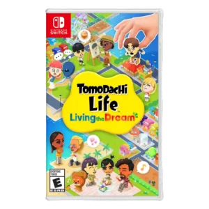
The bright, cartoonish, sometimes photorealistic presentation is generally praised for matching the game's strange and playful tone.
Pros: character customization, fun factor
Cons: content variety, gameplay mechanics
#5
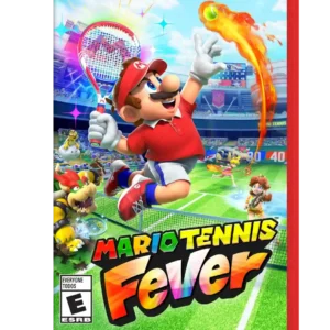
Bright colors, expressive Mario styling, and energetic courts make the game visually inviting. A handful of critics say it does not look transformative for Switch 2, but the overall aesthetic...
Pros: fun factor, gameplay mechanics
Cons: tutorial quality, onboarding experience
#6
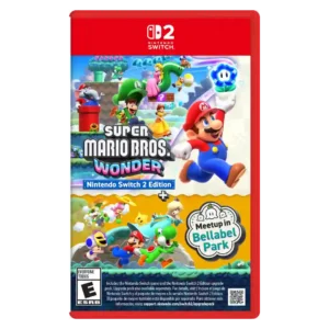
The vivid, expressive visual style is still one of Wonder’s defining strengths, with the sharper Switch 2 presentation helping it pop. A minority view finds the art design less impressive...
Pros: fun factor, multiplayer design
Cons: matchmaking quality, map and navigation design
#7
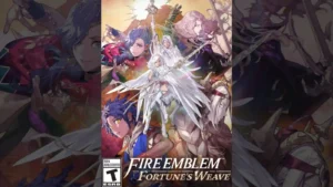
The art direction is generally well received, with praise outweighing the smaller reservations raised across the reviews.
Pros: narrative quality, fun factor
Cons: grind level, learning curve