
Quality-of-life improvements such as visible base prices, quick pricing, and easy-to-navigate interfaces make the sequel much smoother to manage than the original.
Pros: core gameplay loop, difficulty balance
Cons: narrative quality, load times

Quality-of-life improvements such as visible base prices, quick pricing, and easy-to-navigate interfaces make the sequel much smoother to manage than the original.
Pros: core gameplay loop, difficulty balance
Cons: narrative quality, load times
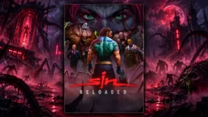
The redesigned UI is cleaner, better scaled, and sharper at modern resolutions while still allowing players to restore the original presentation.
Pros: remake/remaster quality, overall quality
Cons: level design, map and navigation design
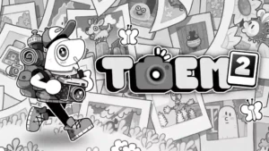
The interface keeps the original’s friendly identity while feeling cleaner and more polished. Menus, journals, and presentation details fit smoothly into the handmade aesthetic.
Pros: game length, gameplay mechanics
Cons: innovation, difficulty balance
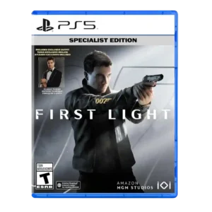
User interface design has limited but very positive evidence around Bond's watch integrating onscreen information cleanly.
Pros: stealth mechanics, combat system
Cons: pacing
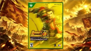
The classic menu layout is easy, clean, and straightforward despite the age of its overall structure.
Pros: remake/remaster quality, graphics quality
Cons: difficulty balance, voice acting
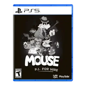
The clean interface keeps objectives and navigation visible without crowding the screen. Its animated elements support the cartoon style while remaining functional.
Pros: fun factor, art direction
Cons: weapon balance, gameplay mechanics
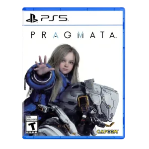
User interface design is praised for streamlined menus and real-time information that reduces friction.
Pros: combat system, emotional impact
Cons: map and navigation design, platforming precision
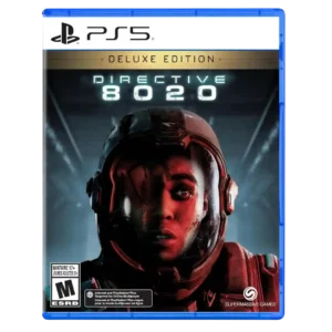
The interface around branching timelines was praised as satisfying for completionists and less repetitive than full replays.
Pros: horror tension, gameplay mechanics
Cons: AI behavior, polish
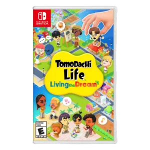
The interface and building tools are repeatedly praised as clean, intuitive, snappy, and easy to use.
Pros: character customization, fun factor
Cons: content variety, gameplay mechanics
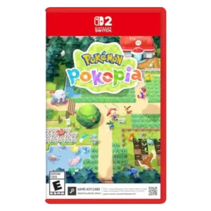
User interface design was praised for clarity, cleanliness, and a more seamless feel than many cozy sims.
Pros: core gameplay loop, content variety
Cons: pacing, menu usability

The interface is intentionally restrained and mostly effective, while additions such as a recent-items view make it easier to track newly collected lore and gear.
Pros: performance optimization, frame rate stability
Cons: controller ergonomics, platform-specific feature support

The interface is generally praised for being clean, minimal, and easy to read, keeping loadouts and combat information understandable without clutter.
Pros: fun factor, combat system
Cons: mission variety, progression system
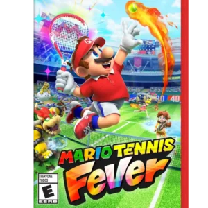
Menus and on-court cues are clean, quick, and easy to read. Reviewers praise both the snappy navigation and the way the UI communicates incoming shots without excessive hand-holding.
Pros: fun factor, gameplay mechanics
Cons: tutorial quality, onboarding experience

Era-specific HUDs and score bugs are visually strong and reinforce the historical presentation, even though overall menu usability is less consistent.
Pros: gameplay mechanics, fun factor
Cons: microtransaction impact, animation quality
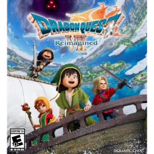
The interface is neat, tidy, and pleasant to navigate, making commands and equipment management much easier to handle.
Pros: combat system, accessibility options
Cons: pacing, difficulty balance
The UI is praised for being restrained, clear, and largely out of the player’s way.
Pros: combat system, fun factor
Cons: pacing, open-world design
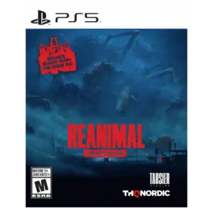
User interface design is praised for restraint, especially the absence of intrusive button prompts.
Pros: narrative quality, atmosphere
Cons: puzzle design, fun factor

Automatic map updates and other conveniences reduce the friction of tracking locked doors and returning to earlier locations.
Pros: overall quality, atmosphere
Cons: boss design, movement feel
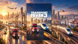
The redesigned interface is widely praised for clearer network data, integrated line management, and better visual feedback, with console and editor-specific exceptions.
Pros: user interface design, gameplay mechanics
Cons: learning curve, tutorial quality
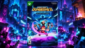
Readable gear details and quick item switching are major conveniences, especially during co-op; some inventory management remains busy or cumbersome.
Pros: open-world design, graphics quality
Cons: narrative quality, endgame content
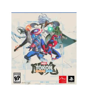
The UI is praised for matching the comic-book aesthetic alongside backgrounds and character models.
Pros: fun factor, character roster
Cons: tutorial quality, competitive balance
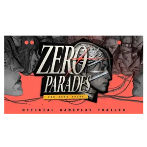
The interface is stylish, tactile, and generally clear despite the game’s complexity. Minor tracking and navigation frustrations keep it from being flawless.
Pros: narrative quality, writing quality
Cons: pacing, bug frequency
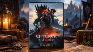
A reorganized HUD and cleaner menus reduce the friction of managing equipment, abilities and everyday interactions.
Pros: graphics quality, value for money
Cons: performance optimization, frame rate stability

K9’s retained passwords, cards and screenshots are useful across loops, though console navigation and simultaneous controls can be awkward.
Pros: puzzle design, user interface design
Cons: core gameplay loop, narrative quality

User interface design gets limited positive evidence from cinematic UI removal during autodrive.
Pros: graphics quality, driving mechanics
Cons: world interactivity, AI behavior

The straightforward interface helps young players learn to play independently.
Pros: content variety, family friendliness
Cons: collectibles, level design

The interface received some positive notes for keeping information manageable, but deeper UI discussion is limited.
Pros: fun factor, open-world design
Cons: collectibles, originality

The physical-style map and document presentation are praised for being useful while fitting the game’s tactile 1990s presentation.
Pros: horror tension, puzzle design
Cons: stealth mechanics, fun factor
The user interface design was positively received for feeling familiar to the anime.
Pros: combat system, companion AI
Cons: open-world design, movement feel
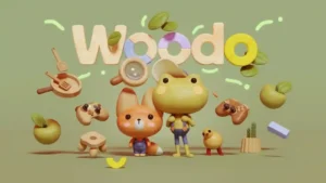
Straightforward menus keep navigation easy.
Pros: art direction, narrative quality
Cons: difficulty balance, replay value

Improved quest markers and navigation make The Island's interface much easier to follow than before, reducing the confusion of finding the next objective.
Pros: fun factor, gameplay mechanics
Cons: grind level, value for money

The interface is generally readable and controller-friendly, but larger rosters and inventories expose friction. Basic navigation works better than deep inventory management.
Pros: combat system, fun factor
Cons: difficulty balance, pacing
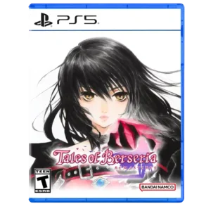
New icons and clearer indicators improve navigation and inventory clarity, but older build menus can still feel convoluted.
Pros: narrative quality, combat system
Cons: remake/remaster quality, value for money
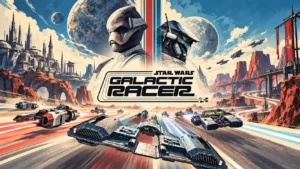
A clean interface, explanatory event text, and a useful logbook help organize the many racing systems. Unclear status information and a PC settings menu without useful visual previews frustrate some...
Pros: fun factor, overall quality
Cons: difficulty balance, pacing

The interface can look clean and attractive, and some updates improve lineup handling, but glitches and inconsistent responsiveness keep the UI from feeling fully polished.
Pros: atmosphere, gameplay mechanics
Cons: AI behavior, commentary quality

The badge menu’s image-based clues support discovery rather than spelling out solutions, but the lack of text or tooltips can become frustrating when an objective is unclear.
Pros: fun factor, puzzle design
Cons: hint system, originality
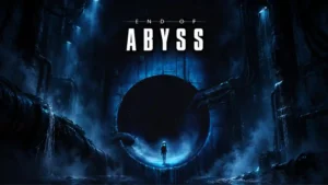
The minimal HUD is praised for cleanliness, but the map interface can malfunction or fail to load, creating a sharp contrast between presentation and usability.
Pros: atmosphere, exploration quality
Cons: map and navigation design, bug frequency
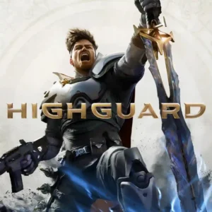
Interface clarity is mixed: one assessment praised readability, while another pointed to obvious rough edges in the 5v5 UI.
Pros: fun factor, combat system
Cons: originality, battle mode quality
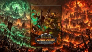
The Glottkin’s consolidated mechanics panel is clean and convenient, but the broader ten-year accumulation of systems has made parts of Warhammer III’s interface harder to parse.
Pros: gameplay mechanics, fun factor
Cons: AI behavior, polish
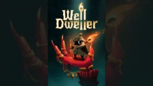
The interface is generally clean and easy to understand, but one review found that remapping face buttons could confuse menu confirmations and cause accidental purchases.
Pros: difficulty balance, boss design
Cons: innovation, sandbox freedom
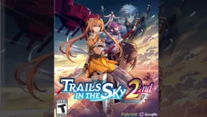
The interface is functional and readable, but one reviewer finds it somewhat plain compared with the otherwise upgraded presentation.
Pros: combat system, narrative quality
Cons: pacing, onboarding experience
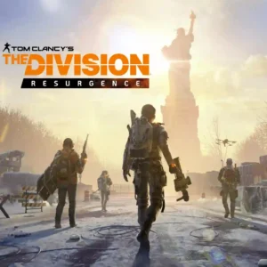
Customizable touch layouts are strong, but dense menus, small-screen crowding, and layered systems often undermine usability.
Pros: content variety, controls responsiveness
Cons: narrative quality, menu usability
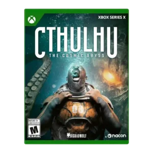
UI evidence was split between praise for The Vault and clean interface and complaints about text size or clumsy controls.
Pros: puzzle design, atmosphere
Cons: horror tension, crash stability
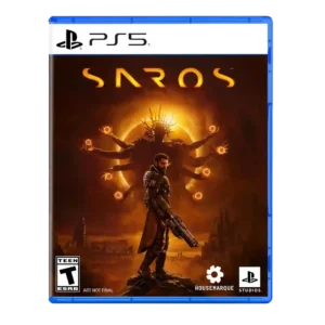
User interface design had limited mixed evidence, with one reviewer finding it good enough but imperfect.
Pros: narrative quality, combat system
Cons: side character depth, dialogue quality
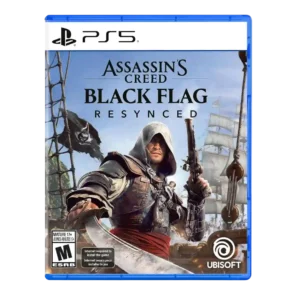
User interface design has a mixed note because one reviewer found the on-screen combat UI somewhat messy despite being understandable.
Pros: graphics quality, remake/remaster quality
Cons: DLC value, multiplayer design

Opinions on the user interface design are mixed, balancing worthwhile ideas against noticeable friction or limitations.
Pros: narrative quality, fun factor
Cons: grind level, learning curve

The interface earns mixed reactions: some screens look cleaner and more useful, while others lose readability or feel visually disjointed. Slow menu behavior magnifies those design complaints.
Pros: gameplay mechanics, progression system
Cons: open-world design, AI behavior
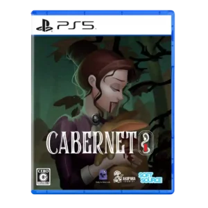
User interface design was mixed: one review found it organized and another effective, but several criticized parsing, hotspot cycling, and rough interface elements.
Pros: narrative quality, voice acting
Cons: bug frequency, menu usability
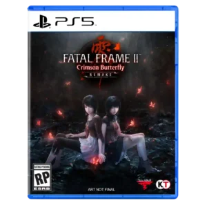
The interface is serviceable, but persistent HUD elements and a few menu choices can feel visually intrusive in such an atmosphere-driven game.
Pros: remake/remaster quality, horror tension
Cons: combat system, frame rate stability

The only direct UI impression compares it neutrally to Fortnite, without a stronger judgment on usability or style.
Pros: replay value, difficulty balance
Cons: game length, boss design