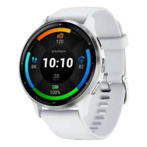
The user interface is a strength, with many reviewers praising intuitive layouts, easy navigation, useful shortcuts, and accessible watch data.
Pros: battery life, GPS accuracy
Cons: smartwatch features, smartphone notifications

The user interface is a strength, with many reviewers praising intuitive layouts, easy navigation, useful shortcuts, and accessible watch data.
Pros: battery life, GPS accuracy
Cons: smartwatch features, smartphone notifications
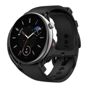
The user interface was considered easy to learn and understand, with reviewers emphasizing clean, lightweight, simple interactions.
Pros: battery life, workout tracking variety
Cons: call handling, smartphone notifications

The watch interface is generally praised as intuitive, smooth, responsive, and well balanced.
Pros: value for money, battery life
Cons: smartwatch features, app ecosystem
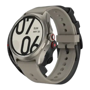
The interface was mostly praised as positive, breezy, or easy to use, though one reviewer found Mobvoi's health-app structure confusing.
Pros: battery life, display quality
Cons: voice assistant quality, sleep tracking accuracy
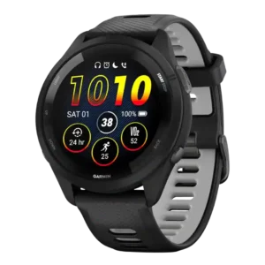
The user interface was mostly praised as intuitive, easy to use, and rich with on-watch data.
Pros: battery life, value for money
Cons: mapping and navigation, smartwatch features
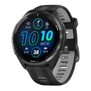
The interface was widely praised as easier, cleaner, more modern, and dramatically improved by AMOLED.
Pros: battery life, GPS accuracy
Cons: smartwatch features, charging convenience
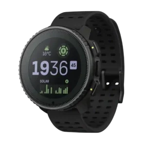
The user interface was generally considered easy or intuitive, despite some lag-related caveats.
Pros: battery life, GPS accuracy
Cons: heart rate accuracy, value for money
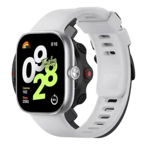
The user interface is generally praised as optimized, fluid, neat, and easy to understand on the larger square screen.
Pros: battery life, display quality
Cons: band quality, smartwatch features
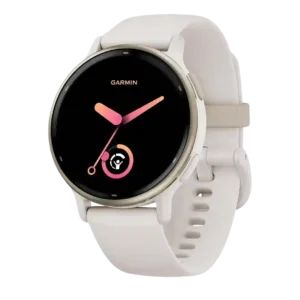
The user interface was generally usable and informative, though not every reviewer found navigation intuitive.
Pros: value for money, GPS accuracy
Cons: sleep tracking accuracy, recovery insights
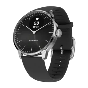
User interface evidence is limited but positive for the hands moving out of the way to clear the digital display.
Pros: style and design, battery life
Cons: charging convenience, smartphone notifications

The interface was often called intuitive and clear, though some reviewers found Samsung’s layout, app clutter, or ecosystem flow clunky.
Pros: software smoothness, comfort
Cons: battery life, GPS accuracy
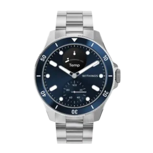
The user interface was split between intuitive simplicity and the limitations of a passive, small-display interface.
Pros: battery life, style and design
Cons: value for money, charging convenience
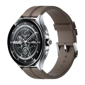
The user interface split reviewers: several found it seamless or clean, while others flagged unintuitive workout access, bugs, or software issues.
Pros: app ecosystem, battery life
Cons: size options, comfort
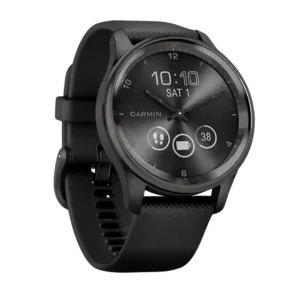
The user interface was mixed: reviewers found it simple enough after adaptation, but also awkward or learning-curve-heavy in some situations.
Pros: style and design, charging convenience
Cons: battery life, charging speed
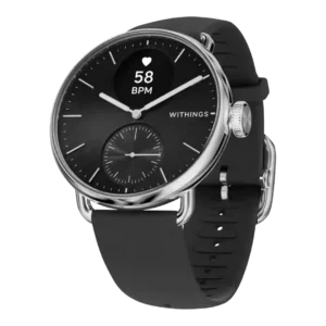
The watch interface was considered simple and readable for basic tasks, but its tiny display and crown-only control made deeper interactions limited.
Pros: style and design, battery life
Cons: smartwatch features, value for money
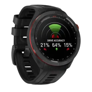
The user interface is polarized: it can feel intuitive, but one review said the S70 feels unlike previous Garmins in a bad way.
Pros: display quality, value for money
Cons: charging convenience, smartphone notifications
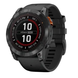
The user interface was polarized, earning praise from one reviewer but strong criticism from another for deep, unintuitive menus.
Pros: battery life, mapping and navigation
Cons: value for money, score tracking
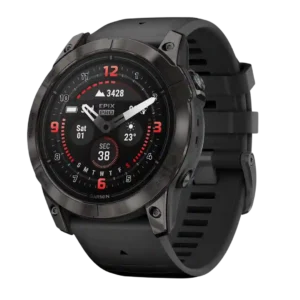
The user interface is powerful but divisive, with repeated complaints about confusing menus, underexplained options, and polish tradeoffs.
Pros: battery life, GPS accuracy
Cons: user interface, fit

The user interface ranges from basic-but-workable to complicated and not user-friendly, with the negatives outweighing the positives.
Pros: comfort, battery life
Cons: companion app quality, value for money
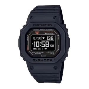
The user interface is one of the weaker areas, especially around data discovery, button-driven navigation, and non-intuitive behavior.
Pros: style and design, display quality
Cons: companion app quality, value for money