Best for visual style
The Gentlemen, Season 2
5.0 attribute score
Highest scored product for this attribute based on supporting review evidence.

Highest scored product for this attribute based on supporting review evidence.
Balances the attribute score, supporting reviews, and overall product strength.
Has the broadest review evidence for this attribute.
Strongest overall product among items with scored evidence for this attribute.
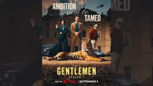
The season’s glossy, tailored visual identity remains a major draw, with lush landscapes, stately interiors and expressive wardrobe choices carrying much of the atmosphere.
Pros: story quality, renewal interest
Cons: season pacing, plot clarity

The show looks polished and premium, with a vivid recreation of the original series’ aesthetic that several critics found strikingly effective.
Pros: emotional impact, plot originality
Cons: entertainment value, character likability
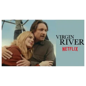
The visual presentation is consistently attractive, with lush forests, river views, scenic town imagery and Mexico locations giving the season an inviting, postcard-like look.
Pros: story quality, emotional impact
Cons: drama quality, writing quality
Glossy prep-school imagery, sunlit water, and scenic lake backdrops give the series a consistently attractive, escapist look.
Pros: sports storyline quality, character development
Cons: romance quality, plot originality
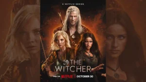
Visual presentation is a major positive, with later episodes, magical battles, and fantasy imagery repeatedly praised for scale and creativity.
Pros: action quality, villain quality
Cons: entertainment value, faithfulness to source material
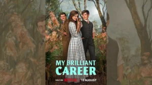
Australian landscapes, sun-drenched estates, and bold period styling make the series visually striking, even for critics who find some modern flourishes excessive.
Pros: main cast performance, entertainment value
Cons: plot originality, sexual content level

Cold seascapes and welcoming interiors make Snook's Arm both beautiful and threatening. Its distinctive location remains appealing when the plot becomes uneven.
Pros: entertainment value, main cast performance
Cons: writing quality, season pacing
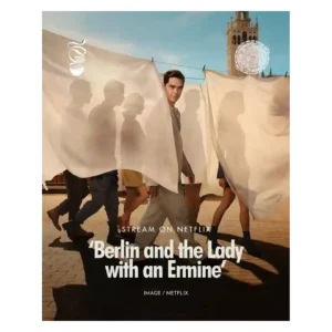
Glossy sunlight, elegant clothing, polished locations, and heightened romantic imagery remain among the season’s most dependable strengths.
Pros: audience appeal, drama quality
Cons: story quality, character development
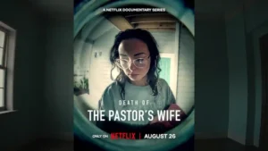
One reviewer praises the polished high-resolution imagery, attractive presentation, and small visual details in the stylized shots.
Pros: emotional impact, educational value
Cons: plot clarity
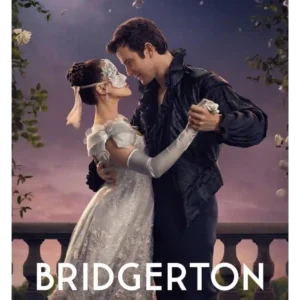
The series remains lush, polished and immediately recognizable, with masquerades, Regencycore pageantry and bright production design continuing to impress.
Pros: entertainment value, story quality
Cons: plot originality, writing quality
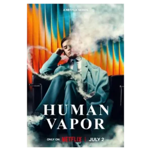
The series has a strong visual identity, from the gloomy palette to the wider Japanese settings. Several reviewers call the production gorgeous or cinematic even when they dislike the pacing.
Pros: special effects quality, story quality
Cons: season pacing, drama quality
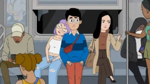
Clean lines, bright colors, soft or deliberately awkward shapes, and expressive faces give the series a recognizable look. Some reviewers find it less visually distinctive than peers, but the overall...
Pros: cast chemistry, animation quality
Cons: humor, plot originality
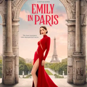
The visual style remains one of Season 5’s most dependable pleasures, with glossy European settings and fashion-heavy imagery, though one critic finds the polish strangely sterile.
Pros: character development, entertainment value
Cons: character balance, story quality
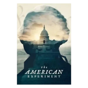
The polished museum-display look, clean visual rhythm, staged reenactments, and approachable documentary movement are major strengths. The same gloss can sometimes soften the messier tensions.
Pros: interview and source material quality, theme depth
Cons: modern political framing, season pacing
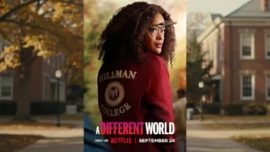
The single-camera look, real campus locations and modern polish generally strengthen immersion, even for viewers adjusting from the original multicam format.
Pros: spin-off quality, cultural representation
Cons: romance quality, season pacing
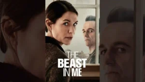
The visual approach is distinctive, using gothic spaces, grain, contrast, harsh shadows, and unusual framing to create unease. Some viewers love the look, while another finds the grittiness pushed too...
Pros: bingeability, main cast performance
Cons: plot twists, writing quality
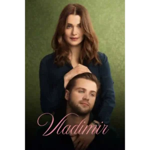
The series usually earns strong marks for its polished, heightened look, expressive color shifts, and stylish presentation. One notable criticism is that the bright Netflix palette can feel overbearing and...
Pros: main cast performance, theme depth
Cons: story quality, character development
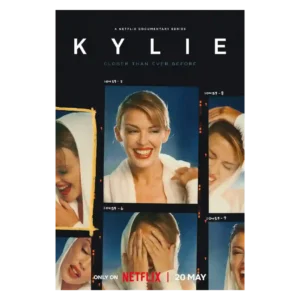
The visual approach is usually praised for personal archives and quiet restraint, though one critic dislikes the shifting aspect ratios.
Pros: emotional impact, interview and source material quality
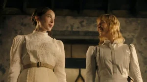
The series' look is a consistent positive, described as stylish, handsome, strange, and visually compelling.
Pros: acting quality, entertainment value
Cons: faithfulness to source material, violence level
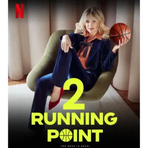
Sunny drone shots and a clean Los Angeles look give the workplace comedy a bright, polished atmosphere.
Pros: main cast performance, supporting cast performance
Cons: season pacing, episode structure

The visual style helps the non-linear story stay readable by clearly separating eras. That clarity matters because the series moves between 1990s aftermath and later reopening.
Pros: story quality, emotional impact
Cons: season pacing
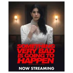
The cold palette, skewed framing, deep shadows, and surreal compositions create a distinctive nightmare mood. Frequent complaints that the image is simply too dark temper that praise.
Pros: suspense, theme depth
Cons: season pacing, story quality
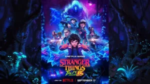
Bold color, neon lighting, clean creature design, and cinematic framing make the season visually distinctive. Even when the underlying story is criticized, the presentation is often admired.
Pros: animation quality, acting quality
Cons: story quality, character development
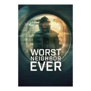
The visual style is a selling point when the mix of stylized visuals, reenactments, and documentary material feels slick. One critic disliked inconsistent visual transitions, so the presentation is not...
Pros: suspense, entertainment value
Cons: theme depth
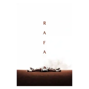
The visual presentation is polished and sometimes striking, with praise for Rafa-on-court imagery and overall audiovisual craft. One critic’s caveat is that the luxurious surface can make the portrait feel...
Pros: theme depth, interview and source material quality
Cons: episode pacing, season length
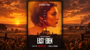
The series is often described as cinematic, painterly, and beautiful, but not everyone agrees: dark lighting and a dreary palette are recurring criticisms. The visual consensus is positive with a...
Pros: main cast performance, story quality
Cons: character balance, episode pacing

Bright candy colors and elaborate rooms create a striking Wonka atmosphere for many. Others find the look gaudy or mismatched with the show’s harsh competition.
Pros: production design, visual style
Cons: entertainment value, faithfulness to source material
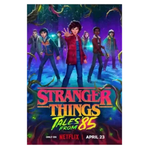
The visual style is bold, colorful, and often cinematic, with luminous lighting and strong environmental design. The human faces are more divisive, ranging from gorgeous and dreamy to cheap, doll-like,...
Pros: entertainment value, animation quality
Cons: spin-off quality, acting quality

The visual package is bold, atmospheric, and often beautiful, shifting from Irish landscapes to neon and ominous imagery. That stylization is also divisive: some found it cartoonish or a case...
Pros: humor, story quality
Cons: plot clarity, season length
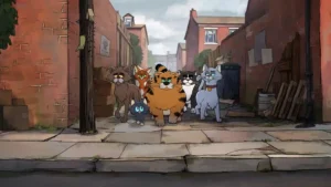
Visual reactions range from wonderfully expressive and beautifully painted backgrounds to ugly, flat, or hideous character designs. The background art earns more consistent praise than the character presentation.
Pros: main cast performance, episode length
Cons: humor, emotional impact
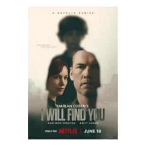
Visual style is serviceable rather than cinematic. Reviewers note Netflix polish and a procedural look, but the style is not described as a major standout.
Pros: bingeability, suspense
Cons: plot twists, entertainment value
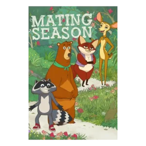
The look is highly divisive. Some praise the bright forest backgrounds, expressive animation, and eventual charm of the designs; others call the style corporate, ugly, or uninspired.
Pros: cast chemistry, acting quality
Cons: humor, character development
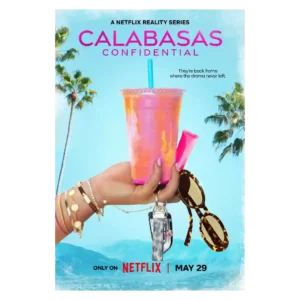
The show consistently looks glossy, polished, and Instagram-ready. That surface appeal is also part of the problem for critics who find the style cheap, overproduced, or hollow.
Cons: audience appeal, story quality
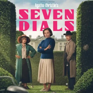
The show can be gorgeous, whimsical, and richly atmospheric, especially in its estates and period settings. At the same time, flat lighting, modern blur, and inconsistent visual choices keep the...
Pros: entertainment value, acting quality
Cons: faithfulness to source material, season length
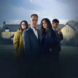
The visual presentation is divisive: some praise a distinct, well-graded look, while others see harsh shadows, odd lenses or grading, and generic streaming aesthetics.
Pros: entertainment value, story quality
Cons: plot clarity, finale satisfaction
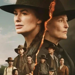
The look ranges from striking landscapes and appealing color work to glossy, washed-out, or generic Netflix imagery. Visual consistency is not a point of consensus.
Pros: main cast performance, production design
Cons: character development, season pacing
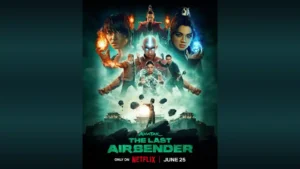
The season can look richly designed and cinematic, but persistent dimness, gray skies, and a stage-like quality are recurring visual complaints.
Pros: character development, action quality
Cons: faithfulness to source material, season pacing
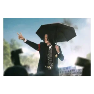
The look is mixed: one review says the production is technically fine, while a video reviewer strongly objects to dark, sinister Neverland imagery. The visual approach can feel polished but...
Pros: media scrutiny portrayal, theme depth
Cons: interview and source material quality, plot originality

Visual style divided reviewers negatively where it came up. The washed-out palette, flat lighting, and muddy coloring were called out as limiting the wonder of the desert and supernatural imagery.
Pros: entertainment value, acting quality
Cons: episode pacing, plot originality
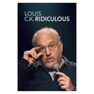
Visual presentation is not a major discussion point, though the close-up framing can feel awkward. The material and performance dominate the conversation far more than the look of the special.
Pros: theme depth, genre satisfaction
Cons: humor, sexual content level
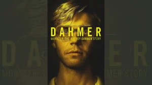
The visual style receives mostly negative criticism in the scored coverage, with complaints about darkness, shallow images, muddy sepia tones, and a fuzzy exploitation-horror look.
Pros: acting quality, cultural representation
Cons: ethical sensitivity, character balance