Best for visual style
Sterling Point
5.0 attribute score
Highest scored product for this attribute based on supporting review evidence.

Highest scored product for this attribute based on supporting review evidence.
Balances the attribute score, supporting reviews, and overall product strength.
Has the broadest review evidence for this attribute.
Strongest overall product among items with scored evidence for this attribute.
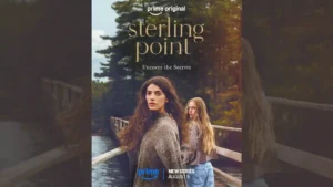
The Canadian lakeside imagery is near-universally praised: warm cabins, green-and-blue scenery, sunsets, water, and forests make the show feel soothing and transportive.
Pros: dialogue quality, theme depth
Cons: character balance, sexual content level
Clean imagery and thoughtful framing support the emotional tone, including a restrained apparition device that keeps Jenny's absence visually present.
Pros: entertainment value, renewal interest
Cons: age appropriateness, character consistency

The reboot retains the franchise's polished, high-budget visual identity, with lavish vehicle photography and strong lighting repeatedly praised.
Pros: franchise connection, entertainment value
Cons: cast chemistry, main cast performance

The series is repeatedly called gorgeous, with windswept landscapes, candlelit interiors and polished period imagery creating a rich romantic atmosphere.
Pros: character development, story quality
Cons: plot originality, realism
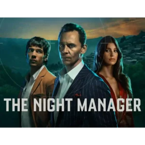
Glamorous locations, moody lighting and luxury surfaces remain signature strengths. Even negative reviews often concede that Season 2 looks polished and expensive.
Pros: entertainment value, renewal interest
Cons: finale satisfaction, plot originality
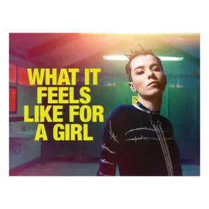
The visual style is bold and memorable, from shifting color palettes to dreamlike flourishes. Even short viewer reactions singled out the visuals as a selling point.
Pros: story quality, main cast performance
Cons: audience appeal, age appropriateness
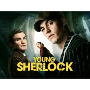
The production is repeatedly described as stylish, polished, cinematic, and visually impressive, even by reviewers who dislike the story.
Pros: entertainment value, cast chemistry
Cons: faithfulness to source material, plot clarity

The lakeside look is one of the most reliable positives. Even mixed or negative reviews often admire the summer atmosphere, Barry’s Bay scenery, and warm visual mood.
Pros: supporting cast performance, main cast performance
Cons: cast chemistry, plot clarity
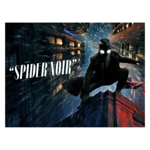
Visual style is the most consistently praised craft area. Reviewers love the black-and-white noir look, shadowy lighting, period styling, and bold color option, though some find the color version more...
Pros: visual style, main cast performance
Cons: story quality, episode pacing
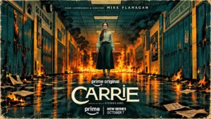
Stylish images and memorable prom imagery give the series a strong visual identity. A smaller group dislikes the glossy teen drama look or washed-out colors.
Pros: main cast performance, character development
Cons: story quality, finale satisfaction

The visual identity is stylish and effectively bleak, with a washed-out palette and elevated sheen, but some viewers find the overall imagery dull or not very memorable.
Pros: suspense, entertainment value
Cons: season pacing, episode pacing

Visual reactions range from praise for the best-looking Reacher season yet to complaints that the series has lost the distinctive style and sense of place of Season 1.
Pros: action quality, supporting cast performance
Cons: story quality, plot clarity
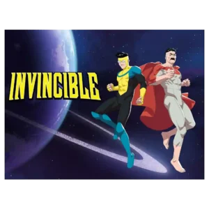
The visual presentation is inconsistent overall, with flat or stiff stretches contrasted against striking frames and strong character-design moments. When the show concentrates its resources, the imagery can still be...
Pros: story quality, character development
Cons: animation quality, season pacing
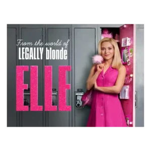
The visual style makes the pink-against-gray contrast easy to read. Some like the bold palette shift, while others find the Seattle look drab, sludgy, or not vibrant enough.
Pros: main cast performance, supporting cast performance
Cons: entertainment value, franchise connection
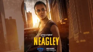
One review argues that the series borrows too much of Reacher’s aesthetic and has not yet developed a strong visual identity of its own.
Pros: main cast performance, spin-off quality
Cons: plot originality, villain quality