
HUD and marker restraint are praised for keeping the view clear and helping exploration feel less like a checklist.
Pros: combat system, narrative quality
Cons: grind level, innovation

HUD and marker restraint are praised for keeping the view clear and helping exploration feel less like a checklist.
Pros: combat system, narrative quality
Cons: grind level, innovation
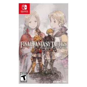
HUD clarity was strongly improved by turn-order displays, clearer stats, and visible tactical information.
Pros: remake/remaster quality, voice acting
Cons: content variety, camera behavior

HUD clarity was praised through clear prompts and on-screen guidance, though broader tutorial flow could feel dense.
Pros: combat system, character roster
Cons: level design, mission design
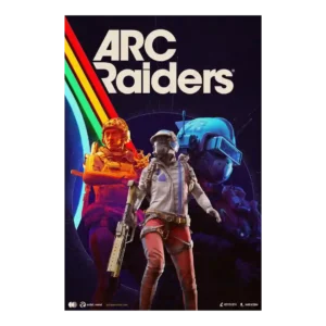
The sparse interface was praised for grounding the player in the world rather than overexplaining the action.
Pros: sound design, combat system
Cons: voice acting, menu usability

Character-specific experience-meter artwork gives a simple status display personality. The decorative details help communicate each adventurer’s identity.
Pros: fun factor, upgrade system
Cons: user interface design, grind level
HUD clarity was praised in limited evidence, with power cues described as clear and not confusing.
Pros: narrative quality, emotional impact
Cons: controls responsiveness, platform-specific feature support
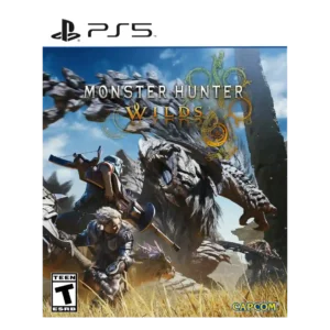
HUD clarity was praised where reviewers noted the ability to resize or disable individual UI elements.
Pros: combat system, narrative quality
Cons: difficulty balance, endgame content

Clearer directional and objective information makes navigation easier to understand at a glance.
Pros: combat system, remake/remaster quality
Cons: animation quality, environmental detail

HUD/readability evidence was limited but positive where reviewers emphasized clear visibility of ramps, rails, and collectibles at speed.
Pros: level design, remake/remaster quality
Cons: soundtrack quality, mission design
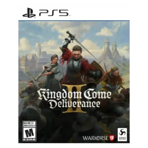
The adaptive HUD was praised for hiding unnecessary elements and improving immersion when information was not relevant.
Pros: combat system, narrative quality
Cons: save system reliability, learning curve

HUD clarity is praised in one review for moving key indicators so more of the screen is left open for visuals.
Pros: remake/remaster quality, graphics quality
Cons: performance optimization, frame rate stability

HUD clarity improved through options to reduce clutter, adjust opacity, and toggle display elements.
Pros: combat system, narrative quality
Cons: difficulty balance, enemy variety
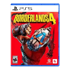
HUD clarity is mixed-to-positive, with a serviceable compass and optional radar helping situational awareness.
Pros: movement feel, loot system
Cons: performance optimization, narrative quality
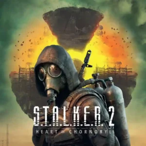
HUD options can support a clean, immersive presentation, but UI glitches and disappearing elements have caused frustration. Immersive Mode is appealing, though its text and subtitle limitations reduce practicality.
Pros: immersion, fun factor
Cons: bug frequency, AI behavior
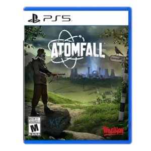
HUD clarity was mixed: one review praised the immersive minimal ammo check, while another wanted clearer ammo information when swapping weapons.
Pros: narrative quality, exploration quality
Cons: combat system, AI behavior
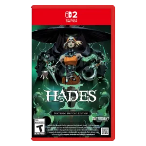
Readability is the main HUD concern, especially portable mode and late-game effect clutter that can make action hard to parse.
Pros: combat system, progression system
Cons: originality

Objective markers and readable tactical information can make navigation straightforward. Small text, crowded prompts, and unmarked extraction requirements sometimes make essential information harder to follow.
Pros: overall quality, level design
Cons: innovation, mission design
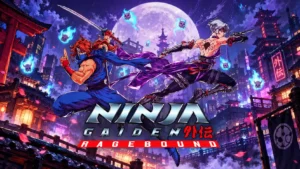
Simple special-attack gauges are easy to understand. A report of missing combo tracking shows how a small HUD failure can disrupt builds that rely on it.
Pros: overall quality, difficulty balance
Cons: frame rate stability, performance optimization
HUD clarity was a minor issue for one reviewer who struggled with small menu text on a TV.
Pros: narrative quality, combat system
Cons: map and navigation design, menu usability

HUD clarity receives a mixed score because flashy combat effects can make the player lose track of the action.
Pros: combat system, faithfulness to franchise
Cons: narrative quality, frame rate stability
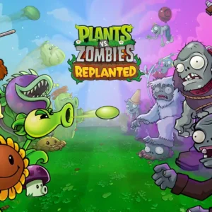
HUD readability is mostly serviceable, but a few details are too small or missing. Reviewers call out hard-to-read text, a tiny progress bar, and an absent boss health bar in...
Pros: fun factor, remake/remaster quality
Cons: graphics quality, soundtrack quality

Important status information is not always easy to read at a glance, with missing overlays and confusing notifications making diagnosis harder than it should be.
Pros: fun factor, graphics quality
Cons: learning curve, bug frequency
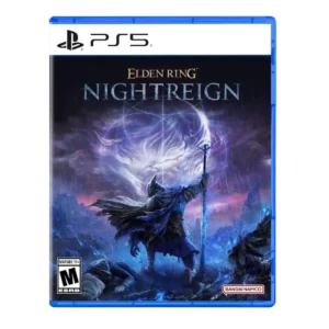
HUD clarity was a mild issue because the minimap presented a lot of information at once.
Pros: co-op experience, fun factor
Cons: difficulty balance, social features

One review found scan-log clarity weakened by indistinct highlighting, making completion tracking more of a hassle than it needed to be.
Pros: boss design, graphics quality
Cons: open-world design, side character depth

HUD clarity was criticized because cooldowns lacked an explicit timer.
Pros: soundtrack quality, narrative quality
Cons: combat system, enemy variety
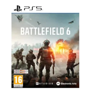
HUD clarity and visibility were criticized for weak indicators and hard-to-see enemies.
Pros: multiplayer design, sound design
Cons: narrative quality, map and navigation design
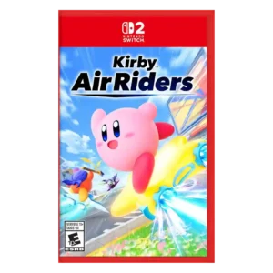
Visual readability drew criticism when chaos, spectacle, and cramped action made information hard to parse.
Pros: battle mode quality, content variety
Cons: learning curve, competitive balance

HUD clarity was criticized where the pop-up inventory exposed only tiny icons during stressful moments.
Pros: puzzle design, narrative quality
Cons: combat system, enemy variety
Thermal visibility can become confusing near the firestorm because glowing flames can resemble enemy targets.
Pros: fun factor, battle mode quality
Cons: multiplayer design, replay value

The Zombies HUD is criticized for visual clutter and too much on-screen information, even though the game offers customization for players who want a cleaner setup.
Pros: multiplayer design, level design
Cons: fun factor, narrative quality
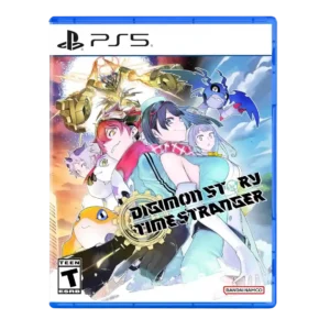
HUD clarity was criticized for frequent pop-ups, messages, and flashing information that made the screen feel crowded.
Pros: progression system, narrative quality
Cons: pacing, content variety

Notifications can overlap important information, with one reviewer reporting the right-side ticker obscuring a key national ledger.
Pros: gameplay mechanics, fun factor
Cons: learning curve, AI behavior

HUD clarity was criticized because battle information and feedback could move too fast or be hard to read.
Pros: combat system, exploration quality
Cons: graphics quality, voice acting
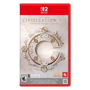
HUD and information clarity were frequent weaknesses, including missing information, hard-to-see tiles, and buried or microscopic details.
Pros: fun factor, economy and resource balance
Cons: progression system, user interface design

Match information is a major weak spot, with pass maps, heat maps and other analytical views removed or harder to read. Several players felt they had less useful information for...
Pros: gameplay mechanics, animation quality
Cons: user interface design, bug frequency
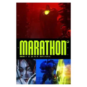
HUD readability has clear weaknesses, including very small text and objective markers that can be hard to spot. Those problems are especially costly when the game is already asking players...
Pros: fun factor, loot system
Cons: difficulty balance, quest design

Interface clarity is one of the weaker areas when missions become busy. Reviewers report losing track of cursors or icons and struggling to select targets quickly.
Pros: choice impact, narrative quality
Cons: gameplay mechanics, QTE design