HUD clarity is praised for the watch-based interface being clean, pleasing, and on point.
Pros: level design, user interface design
Cons: AI behavior, facial animations

Showing Electronics only. Switch back to all Video Games anytime.
HUD clarity is praised for the watch-based interface being clean, pleasing, and on point.
Pros: level design, user interface design
Cons: AI behavior, facial animations

The HUD is praised for staying clear and readable, with useful indicators and markers that communicate threats and objectives without overwhelming the screen.
Pros: gameplay mechanics, boss design
Cons: age appropriateness, family friendliness
New objective and collectible indicators make the minimap more useful and reduce friction when tracking goals and pickups.
Pros: crafting system, content variety
Cons: monetization fairness, endgame content
HUD clarity was strongly praised in one review that singled out visual clarity as excellent.
Pros: crash stability, HUD clarity
Cons: character development, visual effects quality
Status effects and active conditions are easy to understand at a glance, helping players manage several overlapping systems.
Pros: level design, world interactivity
Cons: performance optimization, menu usability
The minimal or absent HUD helps the frozen world feel immediate and cinematic without obscuring the action.
Pros: HUD clarity, onboarding experience
Cons: user interface design, menu usability

HUD clarity is praised for proximity radar, split-time display options, and UI customization.
Pros: open-world design, replay value
Cons: dialogue quality, writing quality
HUD clarity is praised for minimalism, with reviewers liking the absence of intrusive meters, minimaps, and prompts.
Pros: onboarding experience, environmental detail
Cons: family friendliness, movement feel
HUD/readability comments were positive but limited, emphasizing that the intense spectacle remained coherent and not visually confusing.
Pros: value for money, fun factor
Cons: map and navigation design, side character depth
The compass, objective markers, and optional route guidance usually make goals easy to follow without cluttering the action. Dark gray prompts against the monochrome scenery can still be difficult to...
Pros: lore depth, user interface design
Cons: AI behavior, aiming precision
HUD clarity was supported by time-cost icons that help players understand when actions will advance the clock.
Pros: core gameplay loop, replay value
Cons: value for money, difficulty balance
On-court cues communicate incoming shots clearly without overwhelming players. The UI was praised for helping timing and readability while still letting the tennis speak for itself.
Pros: facial animations, load times
Cons: exploration quality, puzzle design
The HUD can be traded away for modifier capacity, turning basic status information into a build choice. That tradeoff can be engaging for players who like squeezing value from limited...
Pros: level design, content variety
Cons: checkpoint system, lore depth
One review highlights the relationship chart as a helpful on-screen aid for understanding nearby Mii connections.
Pros: grind level, originality
Cons: social features, accessibility options
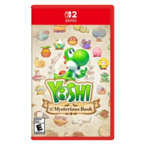
Optional exploration tools can expose useful information and help track secrets, with flexible placement on screen. They arrive late and can make the display feel cluttered if too many are...
Pros: platforming precision, protagonist appeal
Cons: pacing, co-op experience
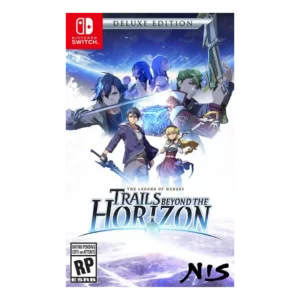
HUD clarity was mixed: the combat UI could be small and busy, while the in-game glossary was described as helpful.
Pros: facial animations, polish
Cons: grind level, stealth mechanics
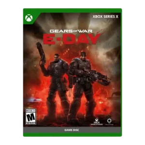
HUD clarity is mixed because the centered active reload display is disliked by one reviewer despite customization options.
Pros: emotional impact, art direction
Cons: value for money, platform-specific feature support
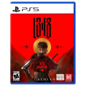
The minimal interface can complement the cinematic presentation, but another reviewer found the bright enemy health bars visually jarring and immersion-breaking.
Pros: visual effects quality, horror tension
Cons: aiming precision, stealth mechanics
HUD clarity had limited negative support, with one reviewer wanting NPC locations added to reduce unnecessary searching.
Pros: accessibility options, protagonist appeal
Cons: frame rate stability, polish
Combat information can get visually crowded, especially once hazards, effects, and many units overlap. Tactical-view tools help, but several reviewers still wanted clearer access to crucial battle information.
Pros: level design, exploration quality
Cons: age appropriateness, family friendliness
HUD clarity is flagged in later build impressions because the stylish combo gauge lacked visual feedback.
Pros: emotional impact, frame rate stability
Cons: server reliability, tutorial quality
Combat can initially feel visually dense, with numerous UI elements and metrics competing for attention until the systems become familiar.
Pros: puzzle design, level design
Cons: crash stability, multiplayer design
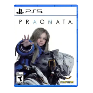
HUD clarity is a concern in one review, where collectible scanning created visual noise and clutter.
Pros: bug frequency, user interface design
Cons: HUD clarity, mission design
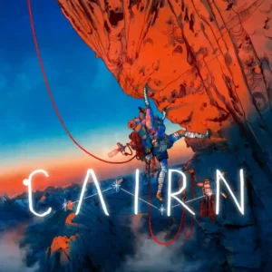
The restrained HUD keeps attention on Aava and the rock, which many reviewers find immersive. The tradeoff is that subtle stamina and grip feedback can be hard to read until...
Pros: open-world design, visual effects quality
Cons: frame rate stability, user interface design
Small tutorial prompts and overlapping combat visuals can obscure important information, making button instructions or attack cues harder to read than they should be.
Pros: accessibility options, checkpoint system
Cons: economy and resource balance, AI behavior
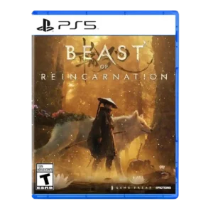
Important targeting information is not always communicated clearly. The missing vine reticle and unexplained combat meters can leave players unsure how a mechanic is supposed to work.
Pros: soundtrack quality, value for money
Cons: onboarding experience, aiming precision
HUD clarity is a weakness in one review because the missing combo counter makes it harder to read perfect-clear performance.
Pros: movement feel, skill tree depth
Cons: menu usability, HUD clarity
HUD feedback has gaps, with some important information either unclear or missing, including situations where damage or objective guidance is harder to read than it should be.
Pros: world-building, stealth mechanics
Cons: boss design, endgame content
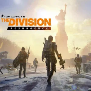
The small-screen HUD can become crowded during intense fights, making enemies, effects, and controls harder to track.
Pros: exploration quality, sandbox freedom
Cons: mission variety, companion AI

On-screen directional prompts can interrupt the flow of a match and make the experience feel less immersive rather than more helpful.
Pros: lore depth, co-op experience
Cons: economy and resource balance, tutorial quality
Combat readability is a recurring problem. Dense blood, particles, cyan sparks, summons, and cramped arenas can turn the screen into visual noise that reviewers struggle to parse.
Pros: world interactivity, immersion
Cons: AI behavior, handheld play suitability
HUD clarity was criticized because one reviewer said the game did not explain the on-screen meters clearly.
Pros: environmental detail, art direction
Cons: world interactivity, loot system
Busy effects, small text, and uneven brightness can make fights or interface information hard to read. A few settings help, but clarity remains inconsistent.
Pros: tutorial quality, monetization fairness
Cons: polish, HUD clarity
A persistent minimap and interface can feel intrusive for players who want an uncluttered, more immersive horror presentation.
Pros: writing quality, checkpoint system
Cons: bug frequency, HUD clarity