Best for visual style
A Knight of the Seven Kingdoms, Season 1
5.0 feature score
Highest scored product for this feature based on supporting review evidence.

Highest scored product for this feature based on supporting review evidence.
Balances feature score, supporting reviews, and overall product strength.
Has the broadest review evidence for this feature.
Strongest overall product among items with scored evidence for this feature.
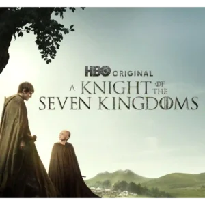
The show favors earthy landscapes, natural light, mud, pageantry, and close-up physical detail over giant CGI set pieces. That restrained aesthetic makes the world feel intimate and beautiful.
Pros: plot originality, episode structure
Cons: character development, family friendliness
The season’s glossy, tailored visual identity remains a major draw, with lush landscapes, stately interiors and expressive wardrobe choices carrying much of the atmosphere.
Pros: finale satisfaction, character consistency
Cons: screenplay quality, release schedule
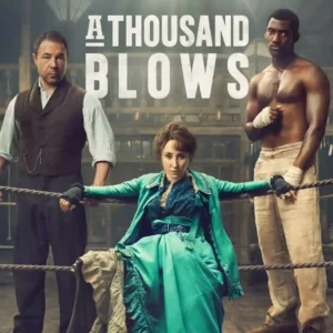
The show remains striking to look at, from foggy cobblestones to ornate interiors and Halloween-lit streets.
Pros: season finale quality, main cast performance
Cons: episode structure, pilot episode quality
The visual style is a clear strength, from gray-toned battlefield imagery to an unusually cinematic scale. The Ukraine material gives the season a look that feels harsher and more distinct...
Pros: character consistency, humor
Cons: media scrutiny portrayal, sexual content level
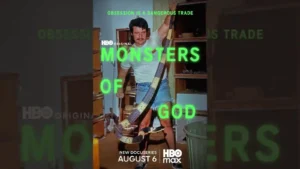
Close-up reptile photography gives the series a vivid, polished look, with the animals themselves repeatedly described as beautifully photographed and visually compelling.
Pros: pilot episode quality, world-building
Cons: season pacing, writing quality

The show looks polished and premium, with a vivid recreation of the original series’ aesthetic that several critics found strikingly effective.
Pros: world-building, visual style
Cons: pilot episode quality, directing quality
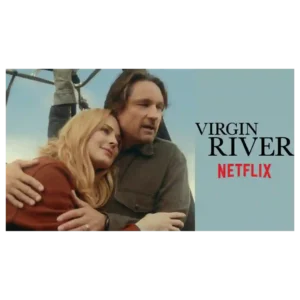
The visual presentation is consistently attractive, with lush forests, river views, scenic town imagery and Mexico locations giving the season an inviting, postcard-like look.
Pros: supporting cast performance, acting quality
Cons: character consistency, screenplay quality
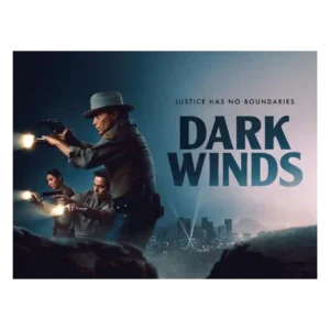
The visual style is moody, eerie, and more horror-tinged than before. Neon, red police lights, desert spaces, and L.A. period texture help the season stand out.
Pros: costume design, directing quality
Cons: family friendliness, age appropriateness
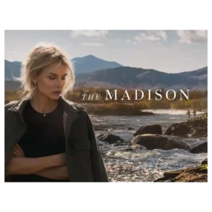
Montana is one of the clearest strengths: reviewers repeatedly praised the sweeping landscapes, rich color, and serene natural imagery. Even skeptical critics often called the series gorgeous.
Pros: main cast performance, suspense
Cons: world-building, language level
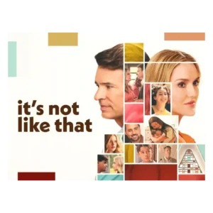
Clean imagery and thoughtful framing support the emotional tone, including a restrained apparition device that keeps Jenny's absence visually present.
Pros: season finale quality, screenplay quality
Cons: character consistency, continuity
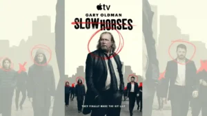
Rain, muted gray-blue tones, wide surveillance-like compositions, and everyday locations give the season a colder, more cinematic look. Reviewers generally felt the visual shift suited the darker story.
Pros: season finale quality, character development
Cons: accent authenticity, product placement

The reboot retains the franchise's polished, high-budget visual identity, with lavish vehicle photography and strong lighting repeatedly praised.
Pros: story quality, episode structure
Cons: suspense, modern political framing

Visual presentation is one of the strongest areas. Reviewers praise the restored footage, colorized stills, and unusually vivid use of video and imagery to make WWII feel immediate.
Pros: visual style, realism
Cons: episode pacing, season pacing
Glossy prep-school imagery, sunlit water, and scenic lake backdrops give the series a consistently attractive, escapist look.
Pros: episode structure, season finale quality
Cons: season length, character consistency
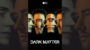
The alternate realities are praised most when small environmental differences create unease rather than relying only on spectacle.
Pros: plot originality, main cast performance
Cons: release schedule, dialogue quality
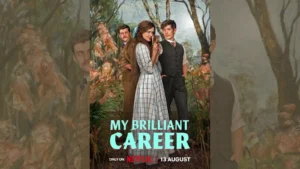
Australian landscapes, sun-drenched estates, and bold period styling make the series visually striking, even for critics who find some modern flourishes excessive.
Pros: pilot episode quality, main cast performance
Cons: family friendliness, continuity
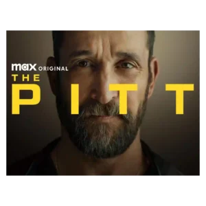
The visual style is grounded rather than flashy, with praise for Pittsburgh scenery, tight hospital shots, and a well-shot real-time feel. Some viewers warn that the medical imagery can be...
Pros: episode structure, main cast performance
Cons: age appropriateness, plot clarity
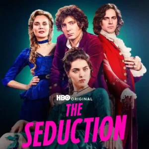
The visual presentation is among the show’s strongest and most consistent qualities: lush, cinematic, opulent, and carefully lit. Even the costume skeptic concedes the camera often minimizes the most distracting...
Pros: episode structure, cast chemistry
Cons: character consistency, editing quality
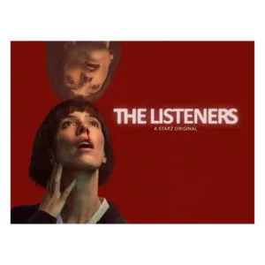
The visual language is a major selling point: chilly, muted, filmic, and often hypnotic. Even mixed critics tend to notice the show’s distinctive art-house texture.
Pros: main cast performance, critic appeal
Cons: character consistency, finale satisfaction
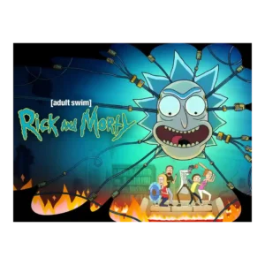
The visual style is praised for scope, spectacle, smoothness, and distinct simplicity. Episode 7’s life-cycle sequence and the premiere’s scale are singled out as memorable visual moments.
Pros: critic appeal, genre satisfaction
Cons: family friendliness, age appropriateness
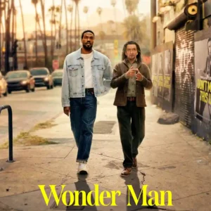
A polished, intimate visual style and the black-and-white Doorman episode help distinguish the show from standard MCU gloss.
Pros: soundtrack quality, pilot episode quality
Cons: accountability handling, plot clarity
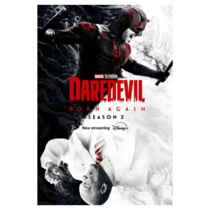
Color, lighting, framing, and the shift toward a more grounded Netflix-era look receive strong praise. Even a more mixed technical review still sees improvement over Season 1.
Pros: costume design, score quality
Cons: realism, plot clarity
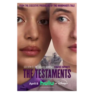
Bright pastels, purple-and-white uniforms, and carefully composed iconography give the sequel a striking look. Even skeptical critics generally acknowledge the polish, though some find it too similar to its predecessor.
Pros: supporting cast performance, realism
Cons: family friendliness, sexual content level
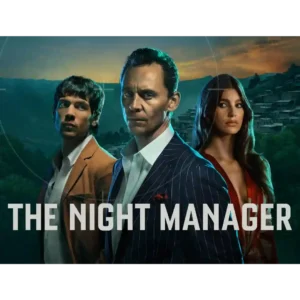
Glamorous locations, moody lighting and luxury surfaces remain signature strengths. Even negative reviews often concede that Season 2 looks polished and expensive.
Pros: episode structure, pilot episode quality
Cons: accountability handling, finale satisfaction
The muted, polished Australian look is generally admired for giving the story a grounded, moody atmosphere. One critic finds the ashy palette less exciting as pure thriller imagery.
Pros: screenplay quality, cinematography
Cons: accountability handling, character consistency
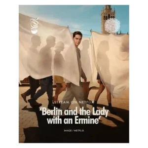
Glossy sunlight, elegant clothing, polished locations, and heightened romantic imagery remain among the season’s most dependable strengths.
Pros: main cast performance, bingeability
Cons: realism, season length
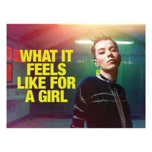
The visual style is bold and memorable, from shifting color palettes to dreamlike flourishes. Even short viewer reactions singled out the visuals as a selling point.
Pros: genre satisfaction, main cast performance
Cons: family friendliness, violence level
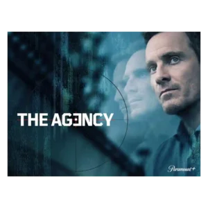
The season’s visual style is described as moody, stylish, and polished, especially in how it distinguishes offices from global field locations. It supports the adult thriller tone without becoming the...
Pros: directing quality, bingeability
Cons: none
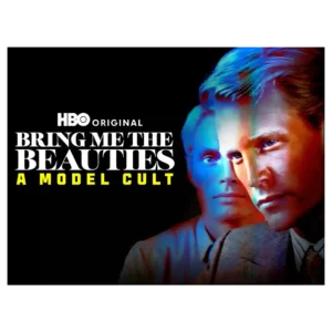
Visual style gets a notable lift from the quoted Wall Street Journal appraisal. The show is framed as stylishly constructed rather than merely lurid.
Pros: bingeability, critic appeal
Cons: editing quality, accountability handling
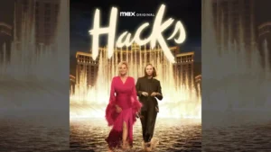
The show keeps a polished visual identity that captures show-business glamour while leaving room for absurdity and intimacy.
Pros: plot originality, episode structure
Cons: season length, realism
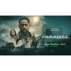
The season’s post-apocalyptic imagery is frequently striking, with a polished, cinematic look that helps sell both the bunker and the wider ruined world.
Pros: directing quality, production design
Cons: character consistency, continuity
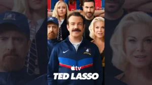
The Kansas City setting gives the premiere a noticeably different look, and the episode makes effective use of that change in visual landscape.
Pros: cast chemistry, supporting cast performance
Cons: episode structure, realism
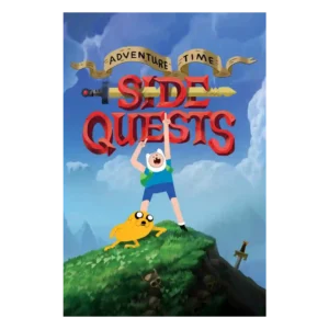
The redesigned look is the most discussed craft element and is mostly praised as fresh, playful, colorful, and still recognizable. A few fans were skeptical at first, but several reviewers...
Pros: production design, animation quality
Cons: pilot episode quality, score quality
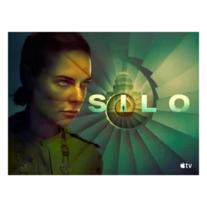
Reviewers like the new visual contrast between the bright Before Times and the dim underground world. The season looks more varied while keeping the silo’s oppressive identity intact.
Pros: drama quality, finale satisfaction
Cons: character development, season pacing
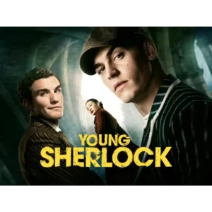
The production is repeatedly described as stylish, polished, cinematic, and visually impressive, even by reviewers who dislike the story.
Pros: pilot episode quality, emotional impact
Cons: continuity, modern political framing
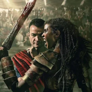
The gritty lighting, stylized blood, scenery, and operatic presentation are widely praised for restoring the franchise identity, though a few critics find individual shots or effects visibly fake.
Pros: episode structure, finale satisfaction
Cons: makeup quality, family friendliness
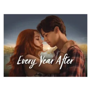
The lakeside look is one of the most reliable positives. Even mixed or negative reviews often admire the summer atmosphere, Barry’s Bay scenery, and warm visual mood.
Pros: directing quality, cinematography
Cons: character consistency, writing quality
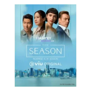
Visuals are the clearest consensus strength. Even negative takes praise the gorgeous Hong Kong setting, yacht-party glamour, and scenery that sometimes outshines the script.
Pros: world-building, cinematography
Cons: finale satisfaction, season finale quality
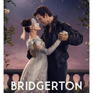
The series remains lush, polished and immediately recognizable, with masquerades, Regencycore pageantry and bright production design continuing to impress.
Pros: rewatch value, supporting cast performance
Cons: CGI quality, continuity
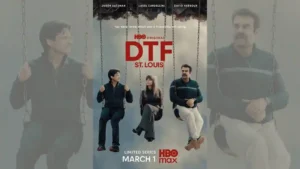
The desaturated palette, brutalist spaces, off-kilter angles, and carefully controlled compositions give the series a distinctive look. One reviewer finds the grayness dull, but most see it as purposeful.
Pros: episode structure, season finale quality
Cons: character consistency, episode length
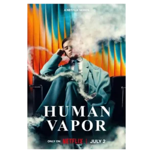
The series has a strong visual identity, from the gloomy palette to the wider Japanese settings. Several reviewers call the production gorgeous or cinematic even when they dislike the pacing.
Pros: plot originality, emotional impact
Cons: humor, writing quality
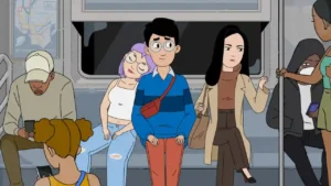
Clean lines, bright colors, soft or deliberately awkward shapes, and expressive faces give the series a recognizable look. Some reviewers find it less visually distinctive than peers, but the overall...
Pros: cast chemistry, acting quality
Cons: family friendliness, age appropriateness
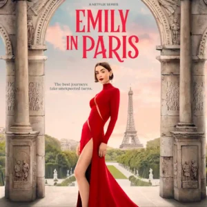
The visual style remains one of Season 5’s most dependable pleasures, with glossy European settings and fashion-heavy imagery, though one critic finds the polish strangely sterile.
Pros: plot clarity, release schedule
Cons: finale satisfaction, cliffhanger effectiveness
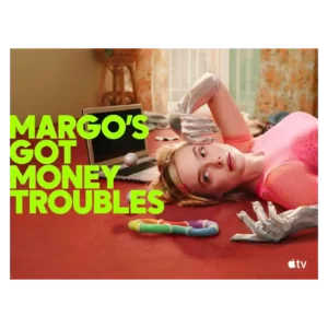
Vibrant color, playful camera work, costumes, and sci-fi videos make the show visually distinctive. Some reviewers found the Hungry Ghost surrealism disjointed from the grounded family drama.
Pros: episode structure, dialogue quality
Cons: plot twists, season finale quality
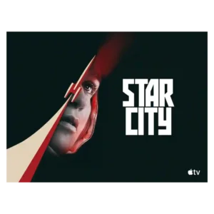
The visual style is cold, gray, analog, and intentionally oppressive, which fits the Soviet-side story well. Most praise its atmosphere, though its bleak palette can make the show feel heavy.
Pros: cliffhanger effectiveness, main cast performance
Cons: humor, family friendliness
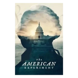
The polished museum-display look, clean visual rhythm, staged reenactments, and approachable documentary movement are major strengths. The same gloss can sometimes soften the messier tensions.
Pros: production design, bingeability
Cons: modern political framing, plot originality
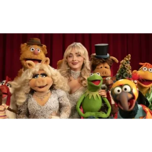
The widescreen, polished presentation updates the look while preserving the theatrical, practical feel that reviewers associate with classic Muppets.
Pros: violence level, world-building
Cons: editing quality, language level
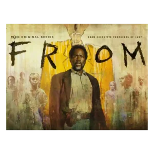
The visual style is strongest when the town itself turns hostile: black skies, red-light dread, and deliberate framing make the supernatural threat feel immediate.
Pros: directing quality, rewatch value
Cons: value for money, makeup quality
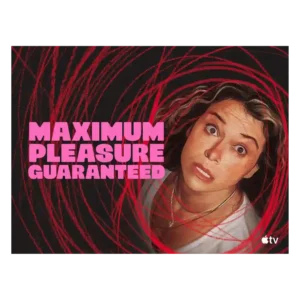
The visual style is bold and voyeuristic, matching a story about screens, privacy, and watching. Its high-octane look is part of the appeal, especially for viewers who like heightened neo-noir...
Pros: acting quality, main cast performance
Cons: family friendliness, age appropriateness
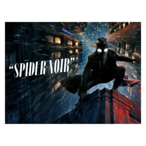
Visual style is the most consistently praised craft area. Reviewers love the black-and-white noir look, shadowy lighting, period styling, and bold color option, though some find the color version more...
Pros: plot twists, cliffhanger effectiveness
Cons: family friendliness, age appropriateness