Best for visual style
Slow Horses, Season 6
4.8 feature score
Highest scored product for this feature based on supporting review evidence.

Highest scored product for this feature based on supporting review evidence.
Balances feature score, supporting reviews, and overall product strength.
Has the broadest review evidence for this feature.
Strongest overall product among items with scored evidence for this feature.
Showing Apple TV only. Switch back to all brands anytime.
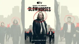
Rain, muted gray-blue tones, wide surveillance-like compositions, and everyday locations give the season a colder, more cinematic look. Reviewers generally felt the visual shift suited the darker story.
Pros: season finale quality, character development
Cons: accent authenticity, product placement
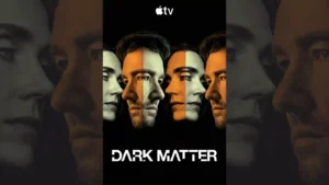
The alternate realities are praised most when small environmental differences create unease rather than relying only on spectacle.
Pros: plot originality, main cast performance
Cons: release schedule, dialogue quality
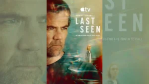
The muted, polished Australian look is generally admired for giving the story a grounded, moody atmosphere. One critic finds the ashy palette less exciting as pure thriller imagery.
Pros: screenplay quality, cinematography
Cons: accountability handling, character consistency
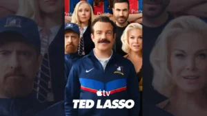
The Kansas City setting gives the premiere a noticeably different look, and the episode makes effective use of that change in visual landscape.
Pros: cast chemistry, supporting cast performance
Cons: episode structure, realism
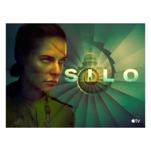
Reviewers like the new visual contrast between the bright Before Times and the dim underground world. The season looks more varied while keeping the silo’s oppressive identity intact.
Pros: drama quality, finale satisfaction
Cons: character development, season pacing
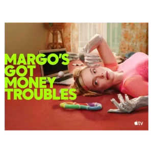
Vibrant color, playful camera work, costumes, and sci-fi videos make the show visually distinctive. Some reviewers found the Hungry Ghost surrealism disjointed from the grounded family drama.
Pros: episode structure, dialogue quality
Cons: plot twists, season finale quality
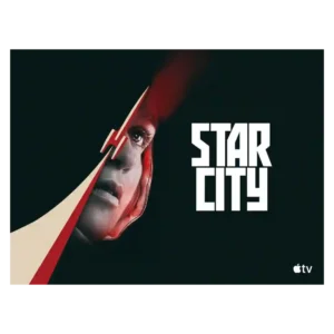
The visual style is cold, gray, analog, and intentionally oppressive, which fits the Soviet-side story well. Most praise its atmosphere, though its bleak palette can make the show feel heavy.
Pros: cliffhanger effectiveness, main cast performance
Cons: humor, family friendliness
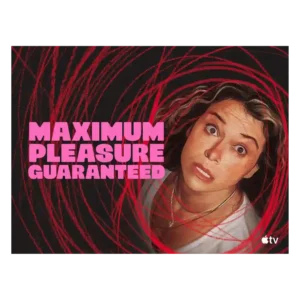
The visual style is bold and voyeuristic, matching a story about screens, privacy, and watching. Its high-octane look is part of the appeal, especially for viewers who like heightened neo-noir...
Pros: acting quality, main cast performance
Cons: family friendliness, age appropriateness
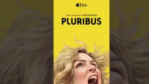
Visual style is a major strength, from desert wides and surreal emptiness to carefully framed interiors and more globally scaled locations.
Pros: dialogue quality, franchise connection
Cons: season finale quality, finale satisfaction
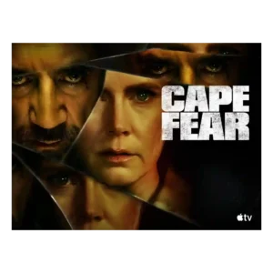
Visual style is bold and divisive: critics liked the lush Southern Gothic look, saturated colors, and dynamic cues, but some found the flourishes cheesy or overdone.
Pros: directing quality, cinematography
Cons: realism, character consistency