Best for visual style
A Knight of the Seven Kingdoms, Season 1
5.0 feature score
Highest scored product for this feature based on supporting review evidence.

Highest scored product for this feature based on supporting review evidence.
Balances feature score, supporting reviews, and overall product strength.
Has the broadest review evidence for this feature.
Strongest overall product among items with scored evidence for this feature.
Showing HBO only. Switch back to all brands anytime.
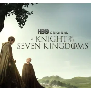
The show favors earthy landscapes, natural light, mud, pageantry, and close-up physical detail over giant CGI set pieces. That restrained aesthetic makes the world feel intimate and beautiful.
Pros: plot originality, episode structure
Cons: character development, family friendliness
Close-up reptile photography gives the series a vivid, polished look, with the animals themselves repeatedly described as beautifully photographed and visually compelling.
Pros: pilot episode quality, world-building
Cons: season pacing, writing quality

The visual style is grounded rather than flashy, with praise for Pittsburgh scenery, tight hospital shots, and a well-shot real-time feel. Some viewers warn that the medical imagery can be...
Pros: episode structure, main cast performance
Cons: age appropriateness, plot clarity
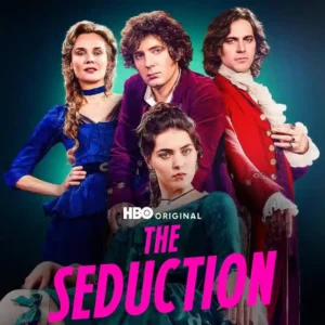
The visual presentation is among the show’s strongest and most consistent qualities: lush, cinematic, opulent, and carefully lit. Even the costume skeptic concedes the camera often minimizes the most distracting...
Pros: episode structure, cast chemistry
Cons: character consistency, editing quality
Visual style gets a notable lift from the quoted Wall Street Journal appraisal. The show is framed as stylishly constructed rather than merely lurid.
Pros: bingeability, critic appeal
Cons: editing quality, accountability handling
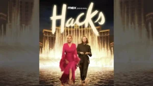
The show keeps a polished visual identity that captures show-business glamour while leaving room for absurdity and intimacy.
Pros: plot originality, episode structure
Cons: season length, realism

The desaturated palette, brutalist spaces, off-kilter angles, and carefully controlled compositions give the series a distinctive look. One reviewer finds the grayness dull, but most see it as purposeful.
Pros: episode structure, season finale quality
Cons: character consistency, episode length
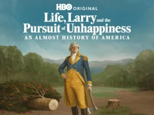
The visual style benefits from period recreations and occasional less-stagey direction. Reviewers generally like the look more than the sketch writing.
Pros: realism, costume design
Cons: editing quality, episode length
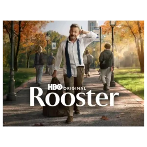
The autumnal campus atmosphere adds cozy appeal even when the broader visual execution is not universally admired.
Pros: screenplay quality, genre satisfaction
Cons: continuity, family friendliness
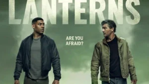
The muted palette and grounded look can be striking, especially against green ring effects, but some viewers find parts of the production visually cheap or too subdued.
Pros: rewatch value, renewal interest
Cons: power scaling, modern political framing
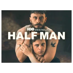
The muted Glasgow setting supports the bleak mood, but later slow motion, distorted breathing, and drab gray imagery strike some critics as exaggerated, distracting, or monotonous.
Pros: season finale quality, screenplay quality
Cons: realism, rewatch value