Best for visual style
It's Not Like That, Chapter 1
4.8 feature score
Highest scored product for this feature based on supporting review evidence.

Highest scored product for this feature based on supporting review evidence.
Balances feature score, supporting reviews, and overall product strength.
Has the broadest review evidence for this feature.
Strongest overall product among items with scored evidence for this feature.
Showing Amazon Prime Video only. Switch back to all brands anytime.
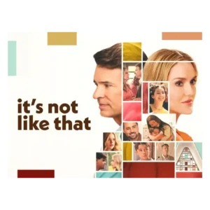
Clean imagery and thoughtful framing support the emotional tone, including a restrained apparition device that keeps Jenny's absence visually present.
Pros: season finale quality, screenplay quality
Cons: character consistency, continuity
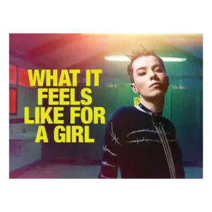
The visual style is bold and memorable, from shifting color palettes to dreamlike flourishes. Even short viewer reactions singled out the visuals as a selling point.
Pros: genre satisfaction, main cast performance
Cons: family friendliness, violence level
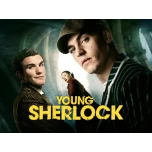
The production is repeatedly described as stylish, polished, cinematic, and visually impressive, even by reviewers who dislike the story.
Pros: pilot episode quality, emotional impact
Cons: continuity, modern political framing
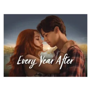
The lakeside look is one of the most reliable positives. Even mixed or negative reviews often admire the summer atmosphere, Barry’s Bay scenery, and warm visual mood.
Pros: directing quality, cinematography
Cons: character consistency, writing quality
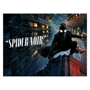
Visual style is the most consistently praised craft area. Reviewers love the black-and-white noir look, shadowy lighting, period styling, and bold color option, though some find the color version more...
Pros: plot twists, cliffhanger effectiveness
Cons: family friendliness, age appropriateness

The visual identity is stylish and effectively bleak, with a washed-out palette and elevated sheen, but some viewers find the overall imagery dull or not very memorable.
Pros: pilot episode quality, main cast performance
Cons: family friendliness, dialogue quality
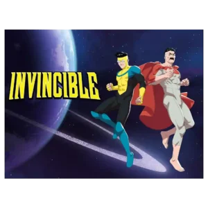
The visual presentation is inconsistent overall, with flat or stiff stretches contrasted against striking frames and strong character-design moments. When the show concentrates its resources, the imagery can still be...
Pros: finale satisfaction, continuity
Cons: plot clarity, screenplay quality
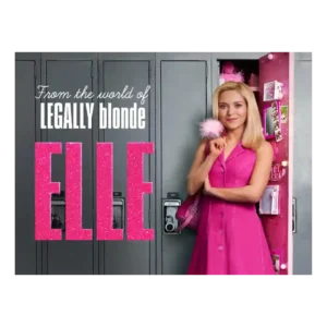
The visual style makes the pink-against-gray contrast easy to read. Some like the bold palette shift, while others find the Seattle look drab, sludgy, or not vibrant enough.
Pros: cast chemistry, bingeability
Cons: episode length, episode pacing