
The show looks polished and premium, with a vivid recreation of the original series’ aesthetic that several critics found strikingly effective.
Pros: world-building, visual style
Cons: pilot episode quality, directing quality

The show looks polished and premium, with a vivid recreation of the original series’ aesthetic that several critics found strikingly effective.
Pros: world-building, visual style
Cons: pilot episode quality, directing quality
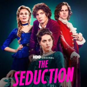
The visual presentation is among the show’s strongest and most consistent qualities: lush, cinematic, opulent, and carefully lit. Even the costume skeptic concedes the camera often minimizes the most distracting...
Pros: episode structure, cast chemistry
Cons: character consistency, editing quality

The visual style is bold and memorable, from shifting color palettes to dreamlike flourishes. Even short viewer reactions singled out the visuals as a selling point.
Pros: genre satisfaction, main cast performance
Cons: family friendliness, violence level
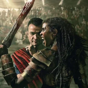
The gritty lighting, stylized blood, scenery, and operatic presentation are widely praised for restoring the franchise identity, though a few critics find individual shots or effects visibly fake.
Pros: episode structure, finale satisfaction
Cons: makeup quality, family friendliness
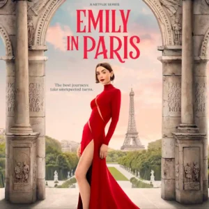
The visual style remains one of Season 5’s most dependable pleasures, with glossy European settings and fashion-heavy imagery, though one critic finds the polish strangely sterile.
Pros: plot clarity, release schedule
Cons: finale satisfaction, cliffhanger effectiveness
The visual approach is distinctive, using gothic spaces, grain, contrast, harsh shadows, and unusual framing to create unease. Some viewers love the look, while another finds the grittiness pushed too...
Pros: plot clarity, series finale quality
Cons: family friendliness, age appropriateness
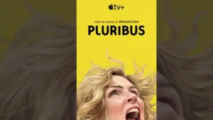
Visual style is a major strength, from desert wides and surreal emptiness to carefully framed interiors and more globally scaled locations.
Pros: dialogue quality, franchise connection
Cons: season finale quality, finale satisfaction

Visual presentation is a major strength across many reviews, with lavish frames, colorful period atmosphere, and sumptuous styling; a few critics object to washed-out grading or trailer lighting.
Pros: finale satisfaction, acting quality
Cons: renewal interest, family friendliness
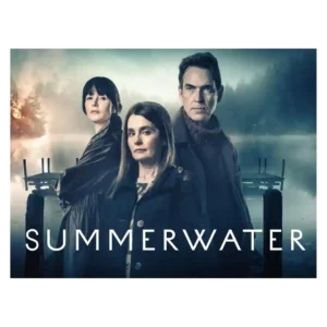
The visual style is moody and scenic, sometimes impressively so, but not always viewer-friendly. Critics praise the grey Scottish atmosphere while also complaining about murky, hard-to-see imagery.
Pros: supporting cast performance, season finale quality
Cons: season pacing, humor

The look ranges from striking landscapes and appealing color work to glossy, washed-out, or generic Netflix imagery. Visual consistency is not a point of consensus.
Pros: cast chemistry, renewal interest
Cons: episode structure, character consistency