
The show remains striking to look at, from foggy cobblestones to ornate interiors and Halloween-lit streets.
Pros: character development, story quality
Cons: character balance, episode pacing

The show remains striking to look at, from foggy cobblestones to ornate interiors and Halloween-lit streets.
Pros: character development, story quality
Cons: character balance, episode pacing

Bright pastels, purple-and-white uniforms, and carefully composed iconography give the sequel a striking look. Even skeptical critics generally acknowledge the polish, though some find it too similar to its predecessor.
Pros: modern political framing, spin-off quality
Cons: violence level, season pacing

The season’s post-apocalyptic imagery is frequently striking, with a polished, cinematic look that helps sell both the bunker and the wider ruined world.
Pros: story quality, emotional impact
Cons: plot clarity, season pacing
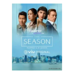
Visuals are the clearest consensus strength. Even negative takes praise the gorgeous Hong Kong setting, yacht-party glamour, and scenery that sometimes outshines the script.
Pros: visual style, main cast performance
Cons: plot originality, story quality

The more shadowy, horror-influenced presentation is a major point of disagreement. Supporters call it claustrophobic, distinctive, and stylish; the harshest critic sees it as muddy, overly dark, and stripped of...
Pros: humor, character development
Cons: season length, writing quality
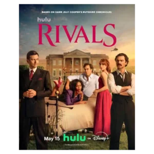
The hyper-saturated palette, sweeping countryside, playful camerawork, and extravagant interiors create a bold look, though some flourishes can be too much.
Pros: character development, entertainment value
Cons: sexual content level, plot clarity
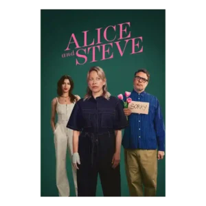
The series has a wry, stylish feel, even in a review that did not find it especially funny. Its look and tone help keep the short episodes breezy.
Pros: humor, main cast performance
Cons: age appropriateness, story quality
The world’s art direction is considered recognizably consistent, but some reviewers find the newer character designs flatter and less textured than the original look.
Pros: franchise connection, character development

The visual presentation drew a muted response in the review that addressed it directly. Stark lighting and dull backdrops serve the drama, but the look was not considered especially distinctive.
Pros: main cast performance, character development
Cons: pilot episode quality
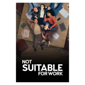
The visual style is glossy and aspirational, full of Manhattan polish and stylish surfaces. That look adds sparkle for some but reads as artificial or visually stale to others.
Pros: acting quality, entertainment value
Cons: humor, cast chemistry
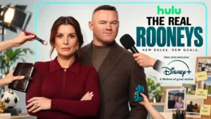
The series has a glossy, Instagram-ready sheen that suits viewers who want luxury and polish. The tradeoff is that the same look can make the supposedly intimate portrait feel staged.
Pros: humor, entertainment value
Cons: realism, marketing accuracy