#1
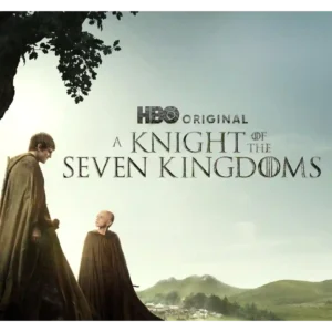
The show favors earthy landscapes, natural light, mud, pageantry, and close-up physical detail over giant CGI set pieces. That restrained aesthetic makes the world feel intimate and beautiful.
Pros: story quality, entertainment value
Cons: violence level, editing quality
#2

Close-up reptile photography gives the series a vivid, polished look, with the animals themselves repeatedly described as beautifully photographed and visually compelling.
Pros: theme depth, story quality
Cons: season length, franchise connection
#3

The visual style is grounded rather than flashy, with praise for Pittsburgh scenery, tight hospital shots, and a well-shot real-time feel. Some viewers warn that the medical imagery can be...
Pros: realism, emotional impact
#4

Glossy offices, expensive clothes, polished London locations, and a sleek HBO finish give the series a luxurious look. Even mixed reviews tend to admire the presentation.
Pros: acting quality, entertainment value
Cons: finale satisfaction, realism
#5
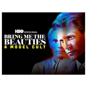
Visual style gets a notable lift from the quoted Wall Street Journal appraisal. The show is framed as stylishly constructed rather than merely lurid.
Pros: story quality, audience appeal
Cons: plot clarity, writing quality
#6

The show keeps a polished visual identity that captures show-business glamour while leaving room for absurdity and intimacy.
Pros: humor, finale satisfaction
Cons: realism, season pacing
#7

The desaturated palette, brutalist spaces, off-kilter angles, and carefully controlled compositions give the series a distinctive look. One reviewer finds the grayness dull, but most see it as purposeful.
Pros: main cast performance, humor
Cons: genre satisfaction, episode pacing
#8

Phone screens and busy visual details reinforce Alex’s overloaded life, though one review finds the show’s polished glamour a little at odds with its claim to everyday realism.
Pros: theme depth, humor
Cons: character consistency
#9
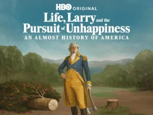
The visual style benefits from period recreations and occasional less-stagey direction. Reviewers generally like the look more than the sketch writing.
Pros: supporting cast performance, audience appeal
Cons: humor, writing quality
#10

The autumnal campus atmosphere adds cozy appeal even when the broader visual execution is not universally admired.
Pros: entertainment value, humor
Cons: story quality, modern political framing
#11

The elegant monochrome look and readable lyrics earn praise. Sparse visual variation leaves some critics wondering how much the screen adds beyond the conversation.
Pros: interview and source material quality, educational value
Cons: directing quality, season length
#12

The muted palette and grounded look can be striking, especially against green ring effects, but some viewers find parts of the production visually cheap or too subdued.
Pros: character development, cast chemistry
Cons: faithfulness to source material, story quality
#13

The muted Glasgow setting supports the bleak mood, but later slow motion, distorted breathing, and drab gray imagery strike some critics as exaggerated, distracting, or monotonous.
Pros: theme depth, emotional impact
Cons: audience appeal, writing quality