Best for visual style
Peaky Blinders: The Immortal Man
4.7 attribute score
Highest scored product for this attribute based on supporting review evidence.

Highest scored product for this attribute based on supporting review evidence.
Balances the attribute score, supporting reviews, and overall product strength.
Has the broadest review evidence for this attribute.
Strongest overall product among items with scored evidence for this attribute.
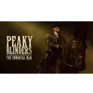
The visual presentation is consistently celebrated: smoky interiors, chiaroscuro lighting, slow-motion swagger, period grime, and large-scale wartime imagery make the movie look distinctly cinematic.
Pros: ending satisfaction, faithfulness to source material
Cons: story quality, pacing
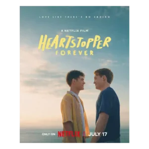
Pastel imagery, animated flourishes, deepened colors, and comic-inspired transitions keep the movie visually distinctive while signaling greater maturity.
Pros: ending satisfaction, cultural representation
Cons: supporting cast performance, pacing

Passenger videos, surveillance footage, and archival images create an immediate, documentary-first visual style. The real material makes the reconstruction vivid and unsettling.
Pros: realism, critic appeal
Cons: theme depth, message quality

The best dance set pieces and cinematography are described as colorful, theatrical, and visually striking, though one reviewer says the overall direct-to-streaming look can feel cheap outside the showcase numbers.
Pros: dance choreography, cultural representation
Cons: plot originality, romance quality
Glossy widescreen images, glamorous moments and a warmer Parisian palette help the movie feel a little larger than its television roots.
Pros: celebrity cameos, humor
Cons: pacing, ensemble balance
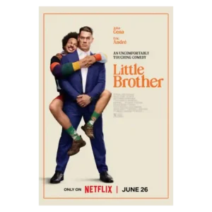
The movie benefits from a good eye for visual gags and readable slapstick staging. Its strongest images serve the physical comedy rather than creating a distinctive overall look.
Pros: acting performance, chemistry between characters
Cons: humor, entertainment value

The festive visual style is one of the most consistently praised elements: snow, lights, cozy interiors, and postcard-like town imagery create strong Christmas atmosphere. A few critics find the look...
Pros: supporting cast performance, lead performance
Cons: humor, genre satisfaction
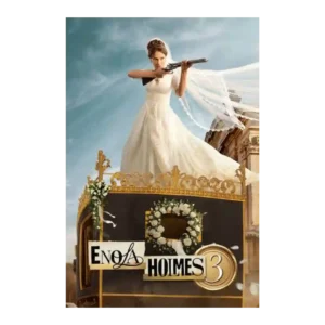
The Malta visuals are one of the clearest strengths, often described as stunning, gorgeous, beautiful, or a refreshing change. A minority dislikes the more polished visual style.
Pros: lead performance, action sequences
Cons: plot clarity, entertainment value
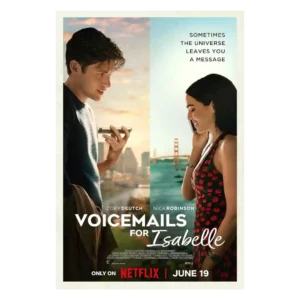
San Francisco provides a glossy, romantic backdrop, and several scenes are beautifully framed. The saturated streaming look can also appear bland and generic.
Pros: story quality, emotional impact
Cons: plot originality, pacing

The sunny travel aesthetic is a major pleasure for many critics, who praise the color, scenery, and romantic escapism. Others dislike the standardized Netflix gloss, bland framing, or lack of...
Pros: entertainment value, romance quality
Cons: character development, story quality
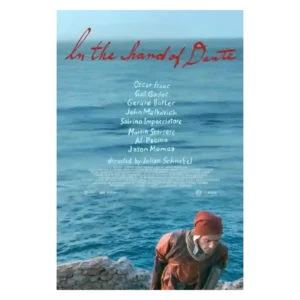
The contrast between widescreen monochrome and boxier color imagery gives the film a distinctive look. Even harsh critics often admire its painterly frames, textures, and locations.
Pros: lead performance, supporting cast performance
Cons: story quality, plot clarity
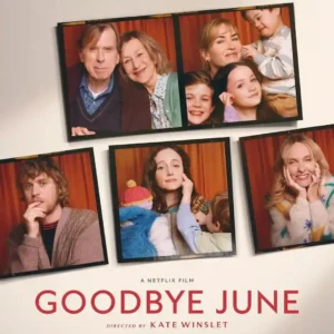
The visual approach is deliberately restrained and performance-centered. Some reviewers find it smooth, clear, and intimate; others call it televisual, overly glossy, inconsistent, or aesthetically jarring.
Pros: acting performance, emotional impact
Cons: screenplay quality, story quality

The film’s look ranges from slick and stylish to dreary or overly glossy. Warm Harvard tones and darker interiors earn praise, while the gray or flat FBI imagery draws criticism.
Pros: acting performance, lead performance
Cons: story quality, suspense
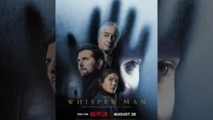
The movie has flashes of strong visual personality—dark framing, creepy houses, and unsettling compositions—but several reviewers feel the overall streaming look is too dim, drab, or generic.
Pros: acting performance, scares
Cons: entertainment value, character development

The film’s dark neo-noir lighting and gritty sheen often create a convincing, cinematic mood. The same darkness is also a recurring complaint, with several viewers finding later scenes murky, ugly,...
Pros: suspense, entertainment value
Cons: action sequences, ending satisfaction

The Christmas visuals are pleasant and polished enough for a seasonal watch, but critics who focused on aesthetics found the look serviceable and generic rather than distinctive.
Pros: lead performance, emotional impact
Cons: humor, originality

Polished imagery and heightened styling appeal to a minority. More frequent complaints describe anonymous visuals, soulless drone shots, and restless movement that drains intensity.
Pros: supporting cast performance, casting quality
Cons: entertainment value, screenplay quality
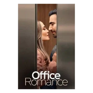
The look ranges from warm and polished to flat and overlit, with destination scenes generally receiving more praise than the office interiors.
Pros: supporting cast performance, lead performance
Cons: chemistry between characters, humor