Best for user interface design
Hollow Knight: Silksong
4.5 attribute score
Highest scored product for this attribute based on supporting review evidence.

Highest scored product for this attribute based on supporting review evidence.
Balances the attribute score, supporting reviews, and overall product strength.
Has the broadest review evidence for this attribute.
Strongest overall product among items with scored evidence for this attribute.
User interface design has limited positive evidence around attractive mission HUD illustrations and attention to detail.
Pros: difficulty balance, art direction
Cons: economy and resource balance, checkpoint system

User interface design was praised for simple navigation and a fitting aesthetic touch.
Pros: soundtrack quality, narrative quality
Cons: combat system, enemy variety

User interface design gets limited positive evidence from cinematic UI removal during autodrive.
Pros: graphics quality, driving mechanics
Cons: world interactivity, AI behavior
UI options such as text sizing and subtitles were appreciated as useful interface support.
Pros: combat system, narrative quality
Cons: difficulty balance, enemy variety
Interface design was split between a UI that stayed out of the way and a cluttered UI complaint.
Pros: combat system, progression system
Cons: pacing, AI behavior

User interface design is mixed-to-weak because the game can feel overloaded or messy despite useful systems.
Pros: graphics quality, accessibility options
Cons: AI behavior, difficulty balance
Interface design is a regular drawback, especially with maps, menus, and navigation that feel awkward for a game this large.
Pros: fun factor, combat system
Cons: bug frequency, narrative quality
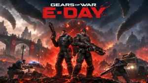
Navigation and pickup messaging are functional, but repeated pop-ups and menu steps for collectibles can interrupt the flow.
Pros: combat system, graphics quality
Cons: exploration quality, mission design