#1
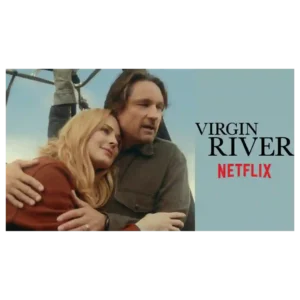
The visual presentation is consistently attractive, with lush forests, river views, scenic town imagery and Mexico locations giving the season an inviting, postcard-like look.
Pros: supporting cast performance, acting quality
Cons: character consistency, screenplay quality
#2
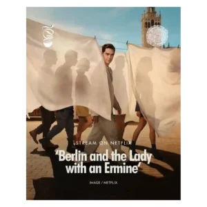
Glossy sunlight, elegant clothing, polished locations, and heightened romantic imagery remain among the season’s most dependable strengths.
Pros: main cast performance, bingeability
Cons: realism, season length
#3
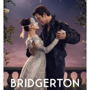
The series remains lush, polished and immediately recognizable, with masquerades, Regencycore pageantry and bright production design continuing to impress.
Pros: rewatch value, supporting cast performance
Cons: CGI quality, continuity
#4
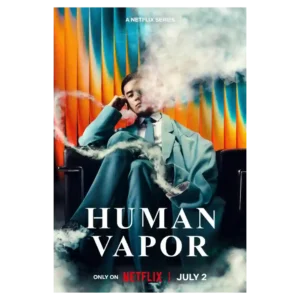
The series has a strong visual identity, from the gloomy palette to the wider Japanese settings. Several reviewers call the production gorgeous or cinematic even when they dislike the pacing.
Pros: plot originality, emotional impact
Cons: humor, writing quality
#5
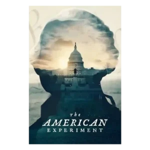
The polished museum-display look, clean visual rhythm, staged reenactments, and approachable documentary movement are major strengths. The same gloss can sometimes soften the messier tensions.
Pros: production design, bingeability
Cons: modern political framing, plot originality
#6
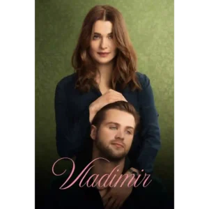
The series usually earns strong marks for its polished, heightened look, expressive color shifts, and stylish presentation. One notable criticism is that the bright Netflix palette can feel overbearing and...
Pros: cinematography, production design
Cons: cliffhanger effectiveness, character consistency
#7
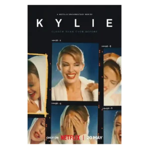
The visual approach is usually praised for personal archives and quiet restraint, though one critic dislikes the shifting aspect ratios.
Pros: episode pacing, season finale quality
Cons: episode structure, season pacing
#8
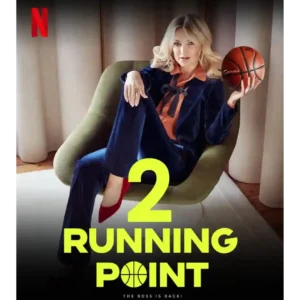
Sunny drone shots and a clean Los Angeles look give the workplace comedy a bright, polished atmosphere.
Pros: media scrutiny portrayal, season finale quality
Cons: cancellation satisfaction, product placement
#9
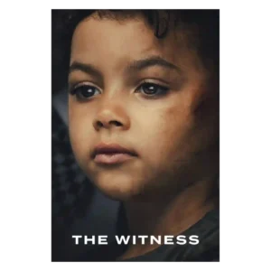
The visual style helps the non-linear story stay readable by clearly separating eras. That clarity matters because the series moves between 1990s aftermath and later reopening.
Pros: screenplay quality, critic appeal
Cons: plot twists, season pacing
#10
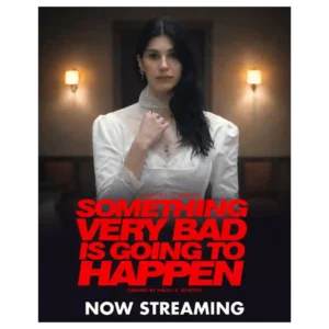
The cold palette, skewed framing, deep shadows, and surreal compositions create a distinctive nightmare mood. Frequent complaints that the image is simply too dark temper that praise.
Pros: special effects quality, soundtrack quality
Cons: screenplay quality, series finale quality
#11
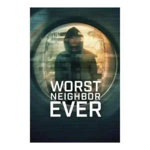
The visual style is a selling point when the mix of stylized visuals, reenactments, and documentary material feels slick. One critic disliked inconsistent visual transitions, so the presentation is not...
Pros: finale satisfaction, season finale quality
Cons: violence level, writing quality
#12
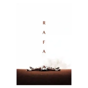
The visual presentation is polished and sometimes striking, with praise for Rafa-on-court imagery and overall audiovisual craft. One critic’s caveat is that the luxurious surface can make the portrait feel...
Pros: genre satisfaction, soundtrack quality
Cons: writing quality, plot clarity
#13
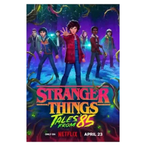
The visual style is bold, colorful, and often cinematic, with luminous lighting and strong environmental design. The human faces are more divisive, ranging from gorgeous and dreamy to cheap, doll-like,...
Pros: world-building, production design
Cons: plot clarity, realism
#14

The visual package is bold, atmospheric, and often beautiful, shifting from Irish landscapes to neon and ominous imagery. That stylization is also divisive: some found it cartoonish or a case...
Pros: character consistency, cast chemistry
Cons: cliffhanger effectiveness, season length
#15
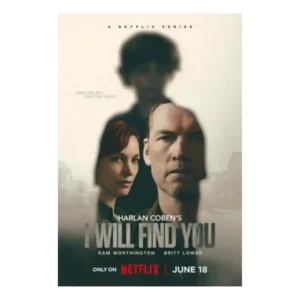
Visual style is serviceable rather than cinematic. Reviewers note Netflix polish and a procedural look, but the style is not described as a major standout.
Pros: cinematography, drama quality
Cons: writing quality, plot clarity
#16
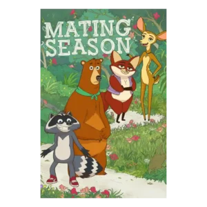
The look is highly divisive. Some praise the bright forest backgrounds, expressive animation, and eventual charm of the designs; others call the style corporate, ugly, or uninspired.
Pros: realism, cultural representation
Cons: age appropriateness, violence level
#17
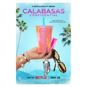
The show consistently looks glossy, polished, and Instagram-ready. That surface appeal is also part of the problem for critics who find the style cheap, overproduced, or hollow.
Pros: world-building, costume design
Cons: family friendliness, age appropriateness
#18
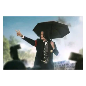
The look is mixed: one review says the production is technically fine, while a video reviewer strongly objects to dark, sinister Neverland imagery. The visual approach can feel polished but...
Pros: directing quality, modern political framing
Cons: value for money, family friendliness
#19

Visual style divided reviewers negatively where it came up. The washed-out palette, flat lighting, and muddy coloring were called out as limiting the wonder of the desert and supernatural imagery.
Pros: main cast performance, acting quality
Cons: cancellation satisfaction, plot clarity
#20
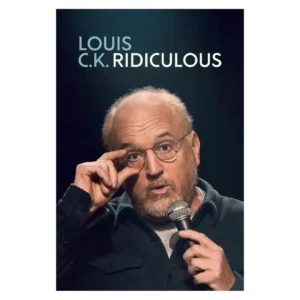
Visual presentation is not a major discussion point, though the close-up framing can feel awkward. The material and performance dominate the conversation far more than the look of the special.
Pros: main cast performance, dialogue quality
Cons: accountability handling, family friendliness