Best for visual style
Wuthering Heights
4.0 attribute score
Highest scored product for this attribute based on supporting review evidence.

Highest scored product for this attribute based on supporting review evidence.
Balances the attribute score, supporting reviews, and overall product strength.
Has the broadest review evidence for this attribute.
Strongest overall product among items with scored evidence for this attribute.
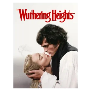
The film’s look is its broadest area of agreement: bold color, texture, gowns, weather, and heightened gothic imagery make it visually memorable even for many detractors.
Pros: visual style, production design
Cons: romance quality, faithfulness to source material

The running children and other stark images linger, while the visual language shifts with each viewpoint.
Pros: acting performance, scares
Cons: pacing, emotional impact

The film pairs inventive compositions and striking camera tricks with a muted, gray-brown palette. Some find the look stylish and distinctive, while others consider it drab, flat, or overly uniform.
Pros: directing quality, cinematography
Cons: humor, violence level
Visual reactions are more divided than the overall reception: many like the look and physical integration, while others call parts of the rendering rough, unpolished, or insufficiently abstract.
Pros: humor, entertainment value
Cons: pacing, visual style

A dirtier space-Western palette helps distinguish the adventure but can also look too gray or muddy for a Supergirl story.
Pros: lead performance, supporting cast performance
Cons: entertainment value, villain quality

The visual style can be striking, dreamlike, and disturbing, but not every choice lands; the square framing and aggressively stylized presentation can also feel irritating.
Pros: lead performance, production design
Cons: humor, message quality
The look is divisive. Some praise jewel tones and polished imagery, but many miss the original’s warmer texture and criticize the sequel as flat, glossy, or antiseptic.
Pros: chemistry between characters, lead performance
Cons: entertainment value, runtime