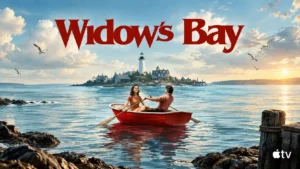
Quickly glimpsed distortions and intentionally old-fashioned island details give the show distinctive visual personality.
Pros: humor, genre satisfaction
Cons: ending satisfaction, season pacing

Quickly glimpsed distortions and intentionally old-fashioned island details give the show distinctive visual personality.
Pros: humor, genre satisfaction
Cons: ending satisfaction, season pacing
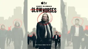
Rain, muted gray-blue tones, wide surveillance-like compositions, and everyday locations give the season a colder, more cinematic look. Reviewers generally felt the visual shift suited the darker story.
Pros: main cast performance, humor
Cons: plot originality
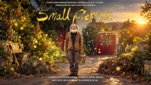
The suburban house and shed mix cozy everyday clutter with fairytale strangeness. Handmade animation and understated detail give the magic a distinctive texture.
Pros: entertainment value, story quality
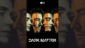
The alternate realities are praised most when small environmental differences create unease rather than relying only on spectacle.
Pros: story quality, theme depth
Cons: plot clarity, season pacing
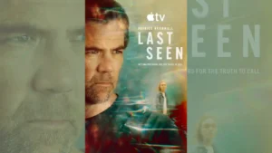
The muted, polished Australian look is generally admired for giving the story a grounded, moody atmosphere. One critic finds the ashy palette less exciting as pure thriller imagery.
Pros: story quality, genre satisfaction
Cons: realism, season pacing
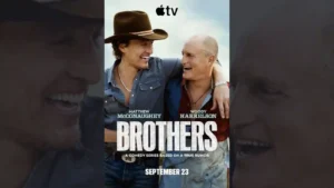
Austin is presented with warm, sun-dappled color and an attractive travelogue-like polish that gives the sitcom unusual visual texture.
Pros: cast chemistry, supporting cast performance
Cons: humor, story quality
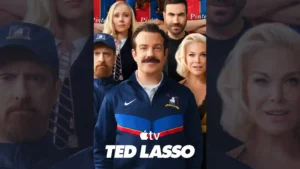
The Kansas City setting gives the premiere a noticeably different look, and the episode makes effective use of that change in visual landscape.
Pros: humor, sports storyline quality
Cons: story quality, character development
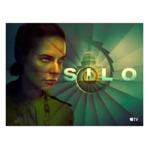
Reviewers like the new visual contrast between the bright Before Times and the dim underground world. The season looks more varied while keeping the silo’s oppressive identity intact.
Pros: main cast performance, episode structure
Cons: season pacing, character development
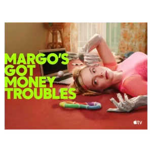
Vibrant color, playful camera work, costumes, and sci-fi videos make the show visually distinctive. Some reviewers found the Hungry Ghost surrealism disjointed from the grounded family drama.
Pros: audience appeal, character development
Cons: season pacing, season length
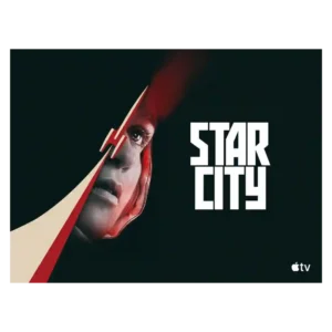
The visual style is cold, gray, analog, and intentionally oppressive, which fits the Soviet-side story well. Most praise its atmosphere, though its bleak palette can make the show feel heavy.
Pros: character development, spin-off quality
Cons: accent authenticity, plot clarity
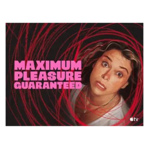
The visual style is bold and voyeuristic, matching a story about screens, privacy, and watching. Its high-octane look is part of the appeal, especially for viewers who like heightened neo-noir...
Pros: main cast performance, supporting cast performance
Cons: plot clarity, season pacing
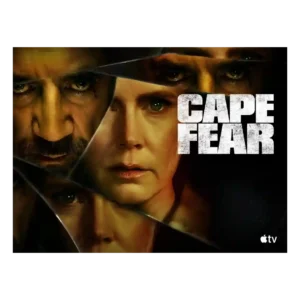
Visual style is bold and divisive: critics liked the lush Southern Gothic look, saturated colors, and dynamic cues, but some found the flourishes cheesy or overdone.
Pros: acting quality, visual style
Cons: story quality, season length
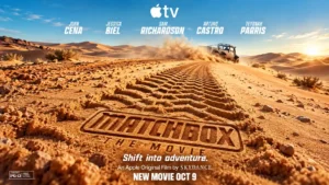
Polished outdoor locations and colorful lighting occasionally stand out against a more anonymous, muted streaming aesthetic.
Pros: action sequences, lead performance
Cons: entertainment value, faithfulness to source material